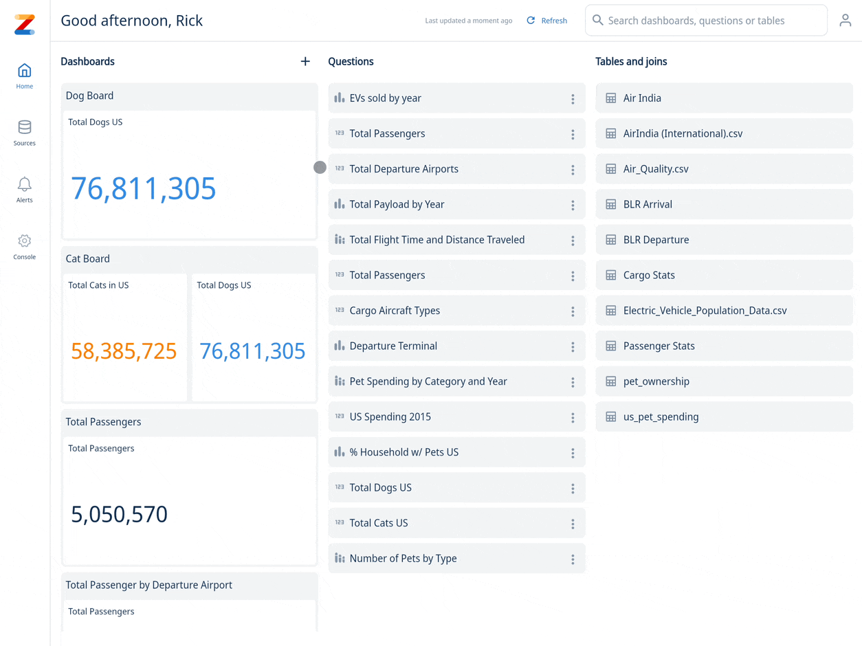
Dashboards
Create dashboards with Zing on Mobile and Web
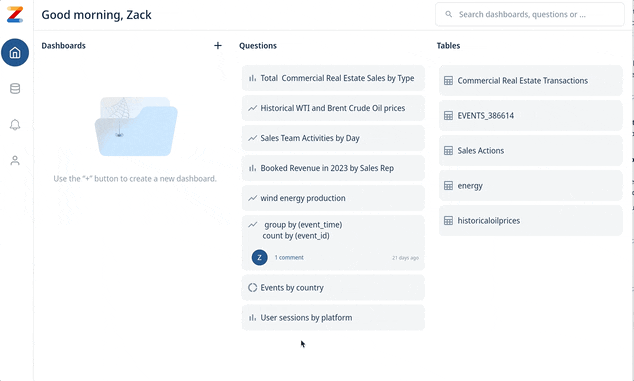
Dashboard previews are shown on your home feed, alongside questions and tables. You can search across saved dashboards, questions, and tables using the search bar at the top.
Creating a dashboard
Dashboards can be created, edited, and viewed on iOS, Android, and the Web.
To create a dashboard:
-
Go to the Zing web console or the Zing Data iOS / Android app.
-
Tap the ‘+’ sign on the upper right of the dashboard section on the home screen. This will open up a blank dashboard canvas.
-
Drag saved questions from the right side list of questions onto the live dashboard canvas to the location you want the question card to appear on the dashboard.
From here you can drag the question card to any location on the canvas, and resize it by dragging a corner. Tap the trash bin icon to delete a question card.
-
Name your dashboard (you must do this before saving)
-
Tap ‘Save’ to save your dashboard.
If you’re creating a dashboard from mobile, the process is the same as above, except questions are shown in a list at the bottom of the dashboard creation screen and are added to a dashboard by dragging them onto the dashboard canvas.
Editing a dashboard
To edit a dashboard, simply click on the dashboard to enter the dashboard screen. Then tap the pencil icon to edit.
- Question cards can be resized by dragging the corners.
- Question cards can be deleted from a dashboard by tapping the trash can icon.
- Question cards can be moved by dragging the header.
Notes about how dashboards work
- When you open a dashboard, Zing will query your data source(s) live, so that dashboards are always populated with the most up-to-date data.
- If you leave the dashboard loaded on the screen for a while, or are within a single session you’ll see the version of the dashboard from when you first clicked on the dashboard in your session. You’ll also see a ’last refreshed’ time at the top.
- Dashboards can have question cards from any mix of data sources.
- A dashboard canvas is 12 squares by 12 squares and a question card can be sized as small as 3x3 or as large as 12x12. So a dashboard can up to 16 question cards (12x12=144 / (3x3=9).
How dashboards display on mobile and web
Questions cards within a dashboard intelligently re-flow depending if you’re accessing the dashboard on web or mobile and the available screen space.
There is no need to build different versions for mobile and web – a single dashboard design fluidly scales across device types:
- On mobile, a maximum of question cards will shown side by side so they are large enough to be easily readable. If the dashboard was designed with more than two question cards, the question cards flow vertically for easy scrolling.
- On web, up to four question cards will be shown side by side.
Interacting with a dashboard
Dashboards aren’t just a collection of questions – they’re live and interactive.
Just tap on a question card to see that question full-screen and see comments and alerts associated with it.
From the question, you can also do the following on iOS, Android, and the web:
- Zoom in / out
- Change the chart type
- Turn on/off data series
- Add alerts for push or email notifications when new data comes in which meets criteria you set (up to every minute or as infrequently as every month) including:
- Percentage change (up or down)
- Percentage increase from previous value
- Percentage decrease from previous value
- Absolute amount increase
- Absolute amount decrease
- Going above a fixed value
- Dropping below above a fixed value
- Sort based on X or Y values
- See the data as a table
- Copy the question and modify or build on it
- Tap into specific values to see more detail
- Save down an image of the graph
- Export a CSV of the data
Sharing a dashboard
- Click on a dashboard on your home screen.
- Click on the Share icon.

- Type the email address(es) of the users you want to share the dashboard with.
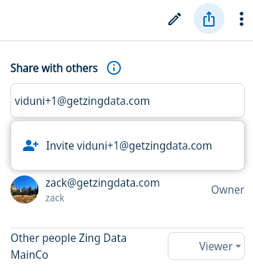
- A user can be invited as a “Viewer” or an “Editor” to a dashboard.
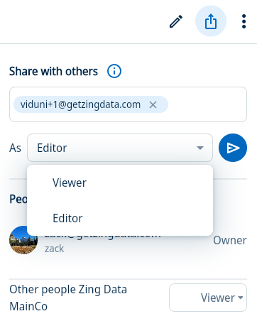
- Select the role and click on the Arrow icon to share the dashboard with the user(s).
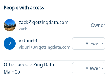
- The list of users the dashboard is shared with will be shown in the Share Panel. The role of the shared users can be updated here. You can also revoke access to the dashboard for a particular user by clicking on the dropdown in front of the user and selecting “No Access”. You can share the dashboard with the entire organization by selecting a role under the organization dropdown.
- The shared dashboard will appear in the user’s homescreen.
- If you share the dashboard with a user who does not have an account with Zing, they will receive an invitation to join Zing and they will be added to your organization as well.
1 - Controls
Create controls for your dashboards
Create interactive filters on dashboards so people can apply filters to one or multiple questions in a dashboard quickly. This works for all questions in Zing created with natural language, or with the visual query builder.
Quick summary:
- Have control widgets that apply to one, multiple, or all questions on a dashboard
- Include control widgets:
- Controls can be simple selections from a list, can be numerical comparisons, open text inputs, or specific dates
- Allow/disallow:
- Search of values within a filter
- Default values for a filter
- Showing Null values in a filter
- Multi-select of values
Add a new control to a dashboard
Controls are basically filters, customized for dashboard purposes. With Zing’s dashboard controls you can navigate your data with
Create a linked dashboard control
This allows a single dashboard widget to control multiple tables, views, and charts. This works even with nested fields (E.g. city field nested under state field), and you designate one table.field as the primary which is used for showing values from that field in the drop-down to a user.
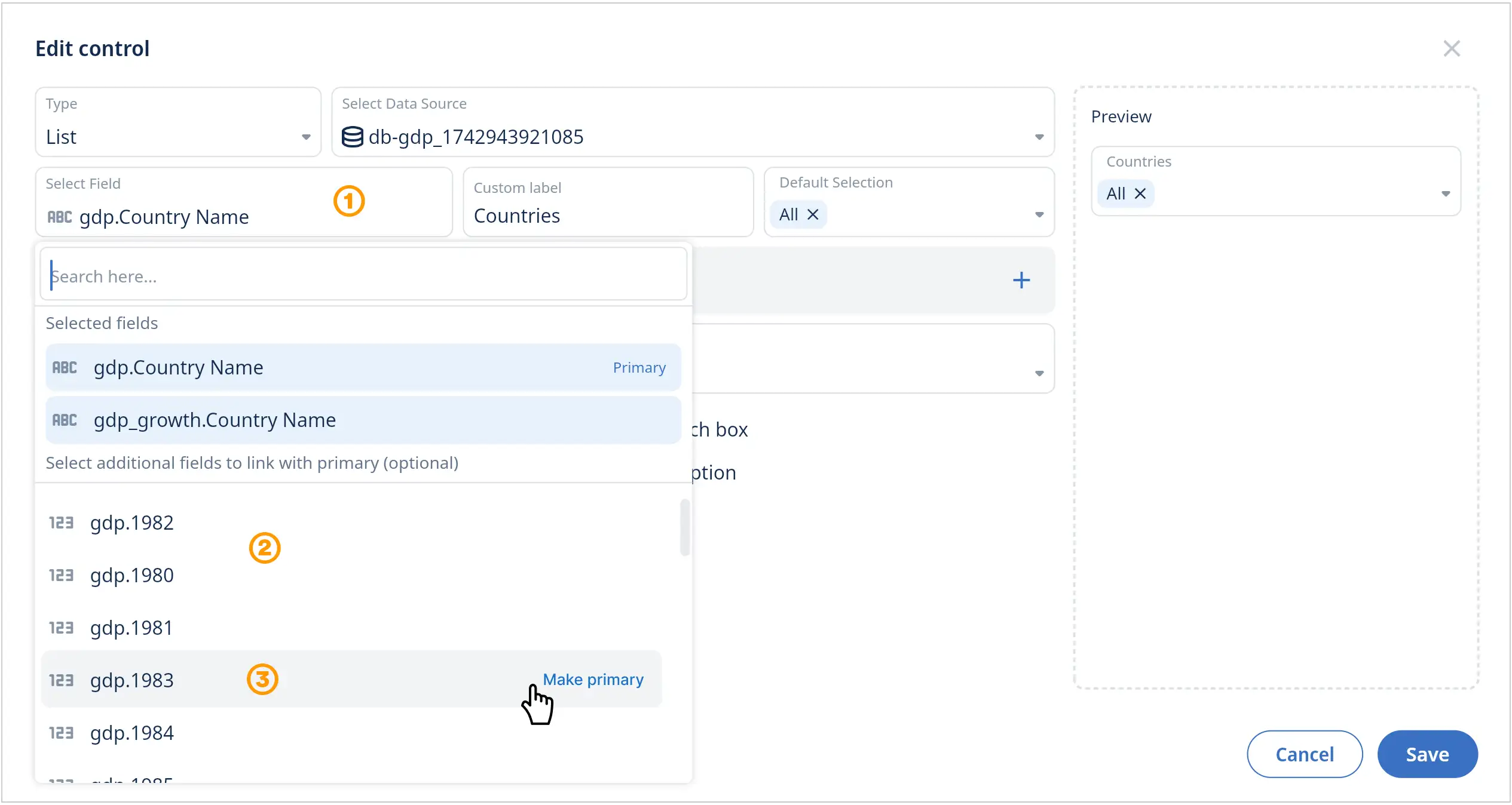
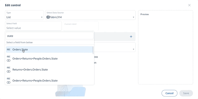
- Add a new control widget to your dashboard or edit an existing one and select the field menu.
- Select your first field from the menu (this will be the primary field).
- Optional: Select additional fields from different tables to link to the primary field.
You can easily edit or select another field in the menu and make it the new primary field. Click ‘Save’ to update the control widget.
- Now, one control widget can update multiple charts in your dashboard that use the linked fields.
- Verify the filters are working as expected for all linked fields and charts.
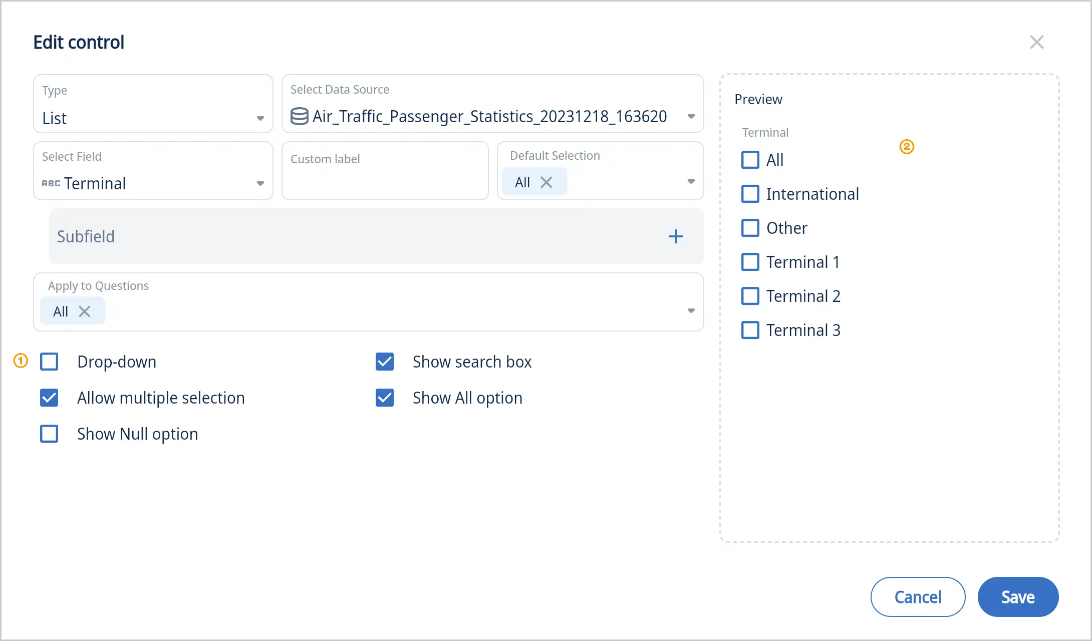
List
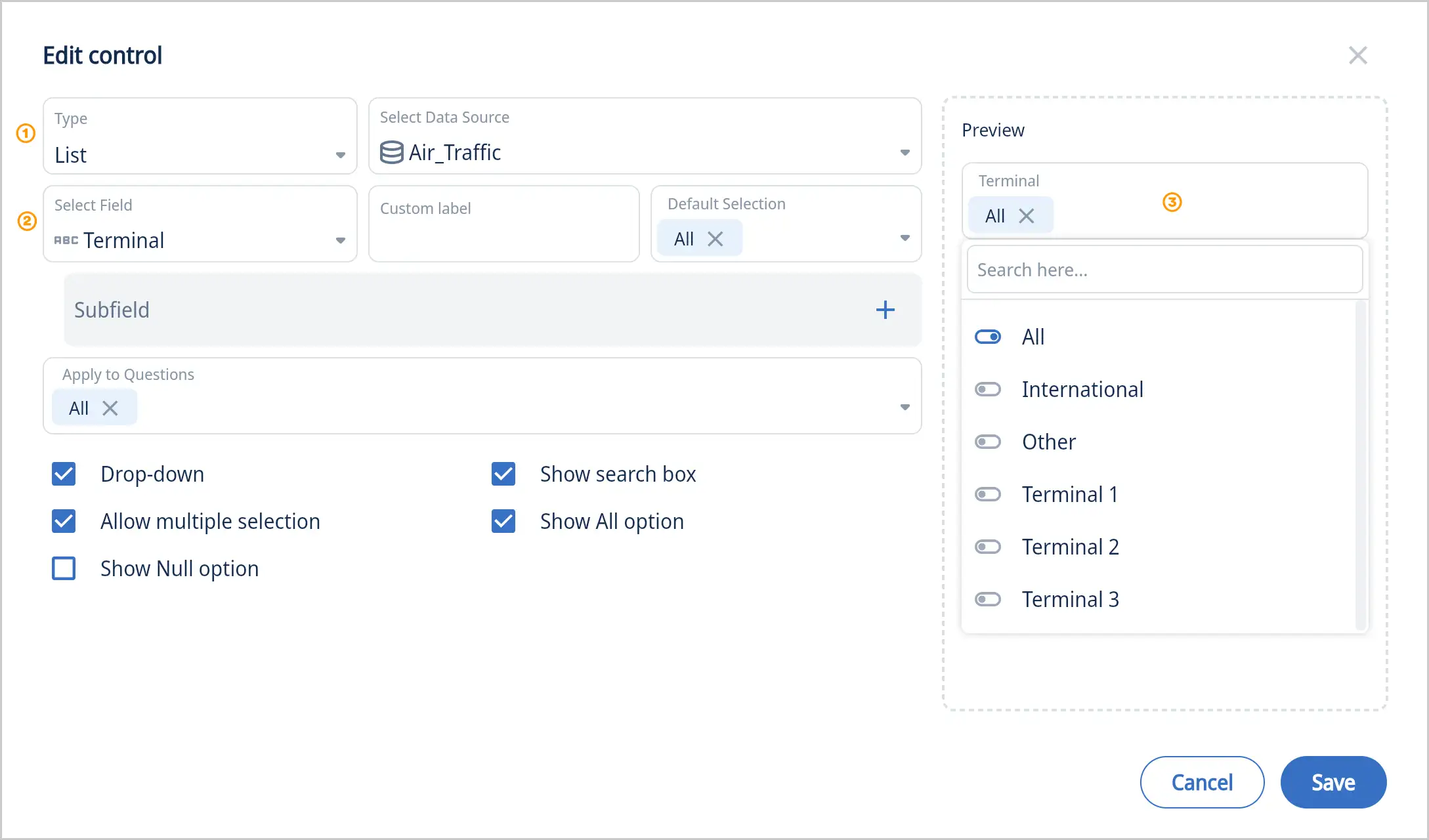
- Select the control type “List”
- Select a field
- Preview the new control with your data
Extra options:
- Uncheck “Drop-Down” to get a simple list vs a drop down menu
- Uncheck “Allow multiple selection” so a user can only select one item
- Check “Show Null option” if the data includes null and you want to make it available
- Uncheck “Show search box” if your list is really short and search is not really needed
- Uncheck “Show all option” if you don’t want that all items can be selected all at once
List with a second list (subfield)
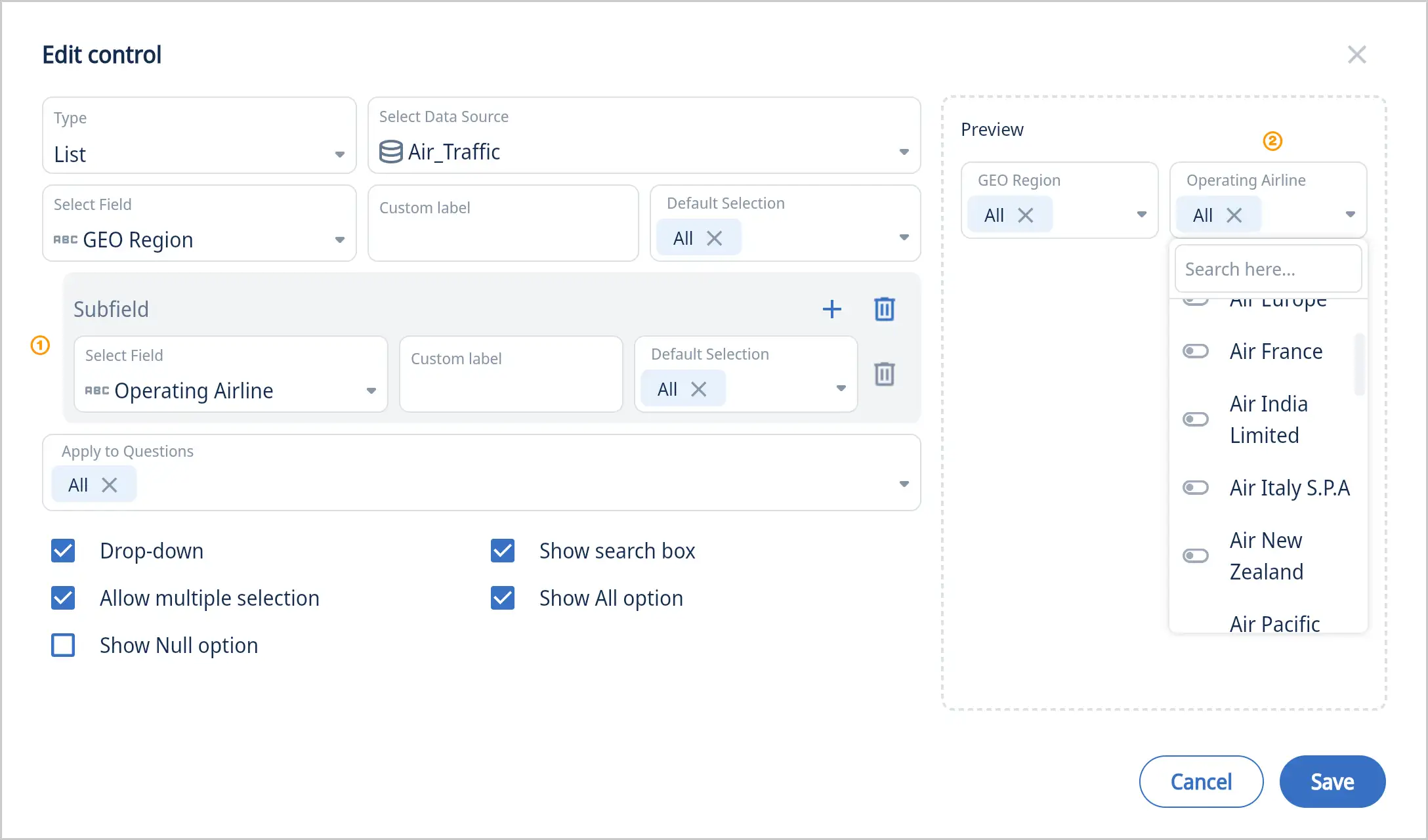
Add a subfield if you want a second list in your dashboard. Example as shown above with Regions in first drop-down menu and Airlines in second drop-down menu
List with no drop-down
Example above is showing a list with “Drop-Down” unchecked. Great for short lists and quick access.
Text
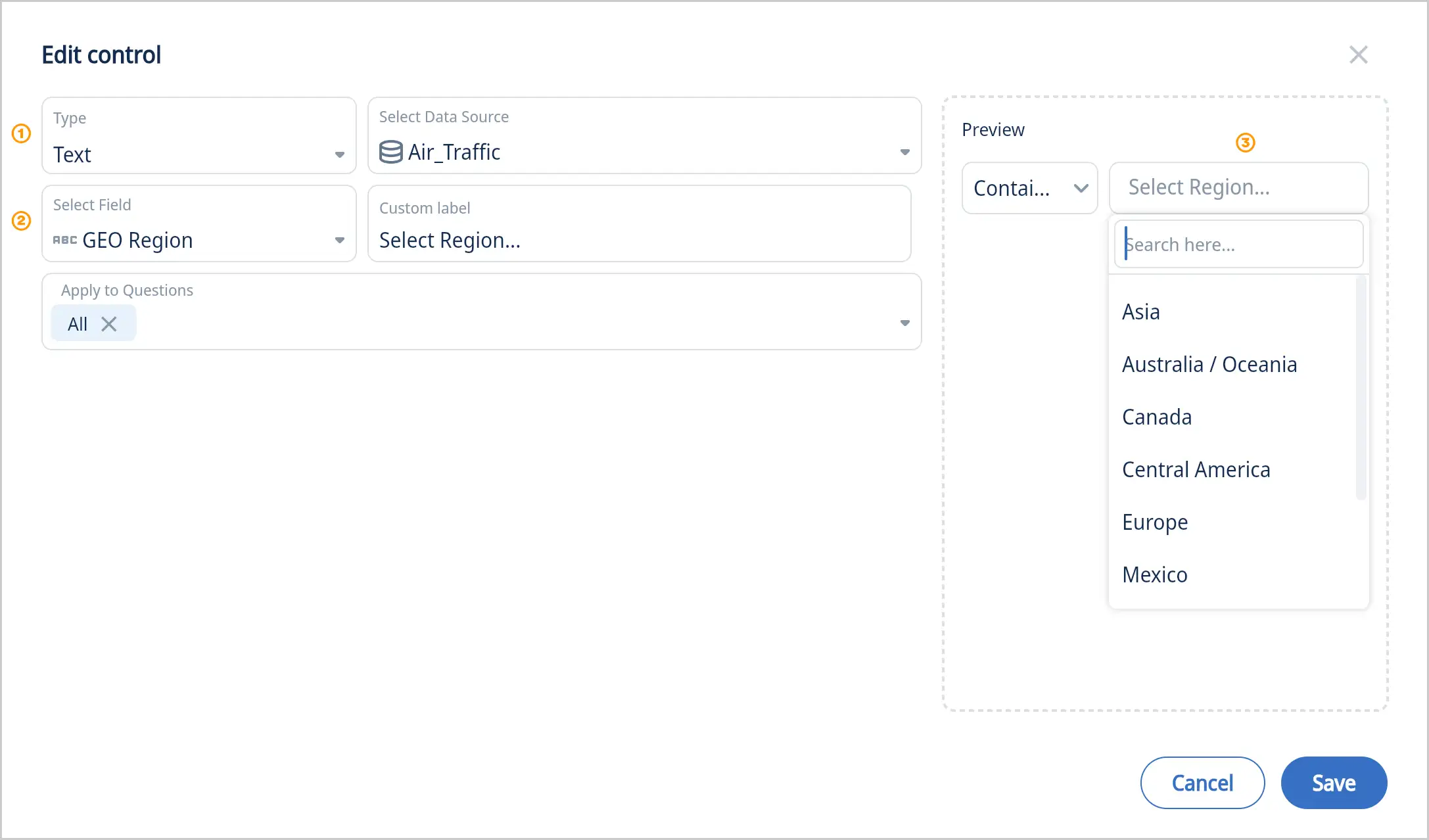
- Select the control type “Text”
- Select a field
- Preview the new control with your data
Number
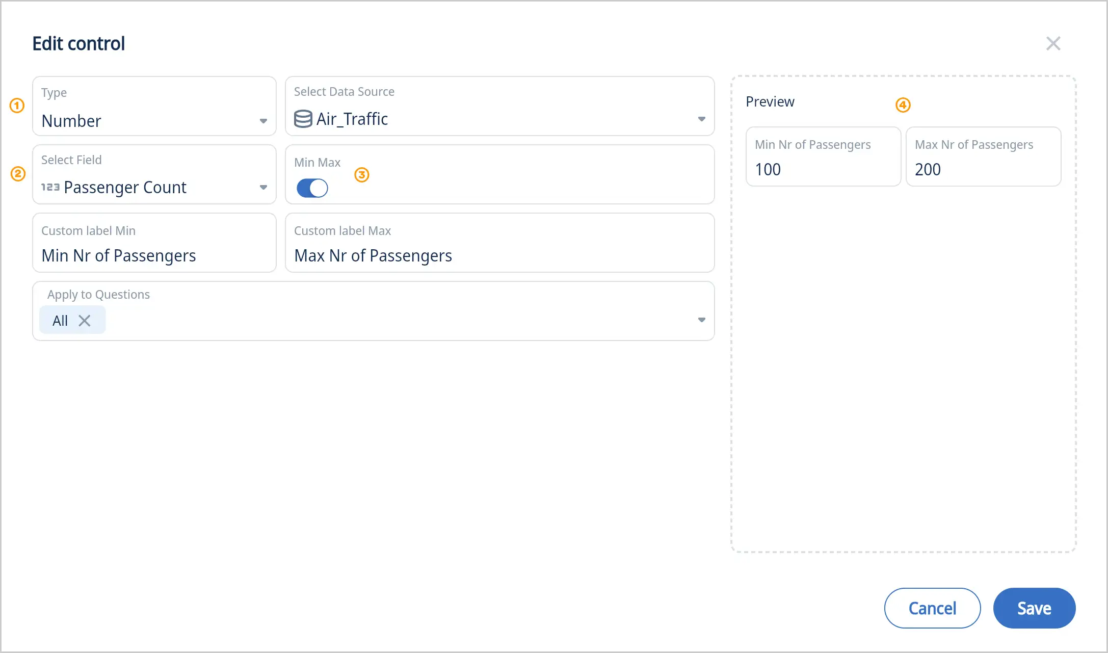
- Select the control type “Number”
- Select a field
- By default the number control is for a single value. Select “Min Max” to limit results in the selected range.
- Preview the new control with your data
Date Range
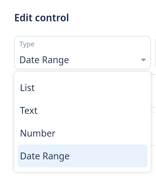
-
Select the control type “Date Range”
-
Select a field
-
Choose from:
- Single date
- Standard comparisons: is, is not, after, before
- Inclusive options: after (inclusive), before (inclusive)
- Data validation: is empty, is not empty
- Range filtering: between, not between
- Relative dates:
-
Week to Date (Starting Sunday)
-
Current Week (Starting Sunday)
-
Week to Date (Starting Monday)
-
Current Week (Starting Monday)
-
Month to Date
-
Current Month
-
Quarter to Date
-
Current Quarter
-
Year to Date
-
Current Year
-
Between a relative date (e.g. past 7 days) and future days (e.g. next 7 days)
-
Past, Future
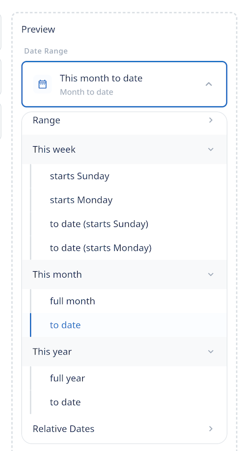
-
Optionally, specify a time comparison range
-
Previous period
-
Previous year
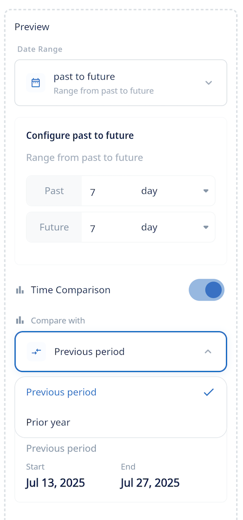
-
Preview the new control with your data
Please note: with date range people can select from “is, is not, after, greater than or equal, before less than or equal, is empty, is not empty, between, not between, relative date”
Enhanced Dashboard Controls:
Sticky Filters when Opening Questions
 When you click into a question from a dashboard:
- The dashboard’s filter values now appear at the top as editable drop-downs
- You can modify these without returning to the dashboard
- The question auto-refreshes with the new filter values
This avoids the back-and-forth between dashboards and questions, saving time and clicks. This upgraded dashboard controls make filtering smoother and more intuitive.
Integration with Other Capabilities
Your filters remain consistent even when using:
- Drill down to explore subgroups
- See values for a breakdown
- Exclude to remove a data point
You’ll keep your filter context throughout your exploration.
Scrollable Dashboard Cards
You can now scroll dashboard cards horizontally. This is especially helpful when viewing tables with many columns or wide visualizations.
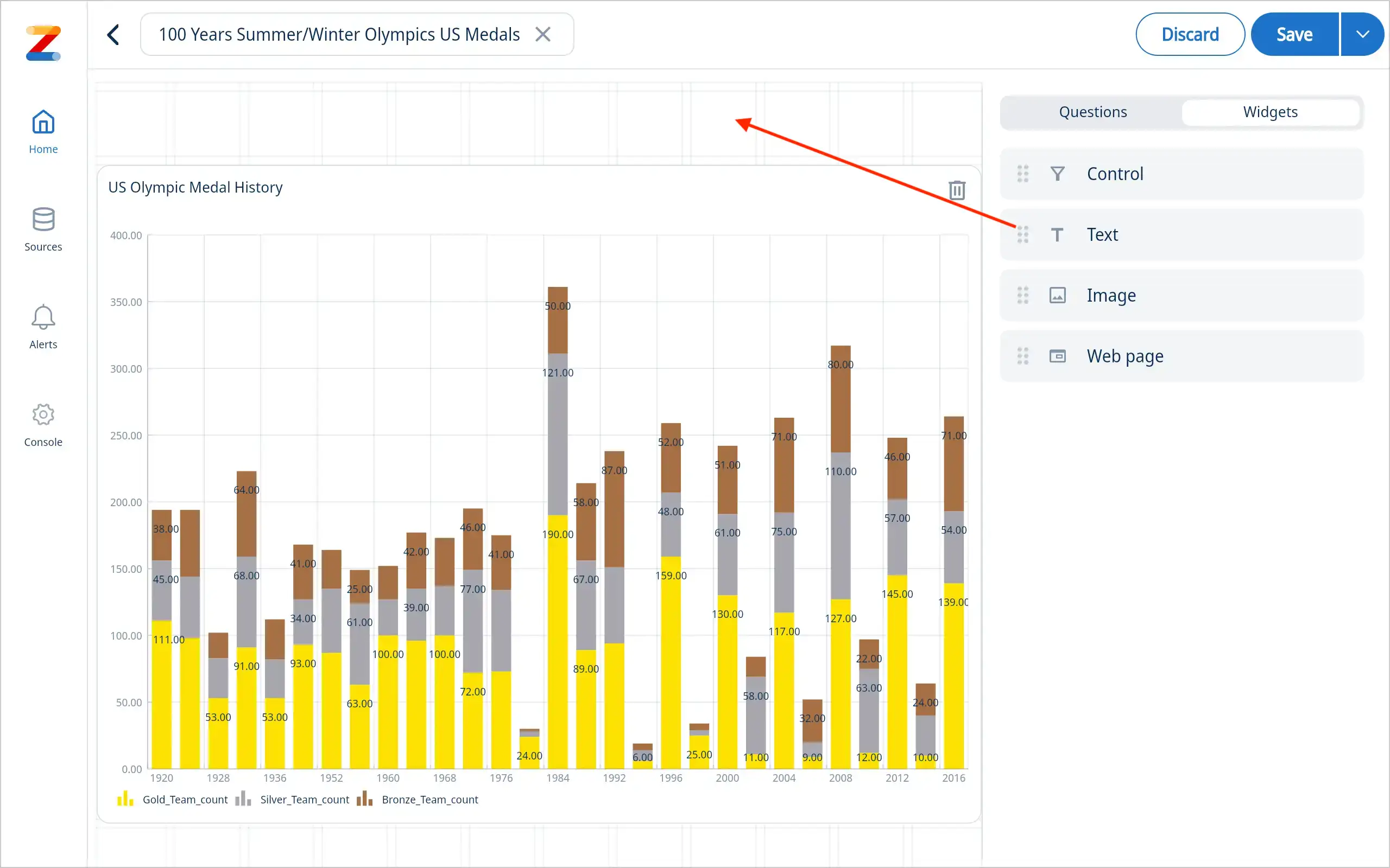
2 - Add text, links, images and web pages to your dashboards
Enhance your dashboards with intuitive widgets that create a rich, interactive experience. Link dashboards seamlessly to each other to unlock deeper insights and provide a more comprehensive view of your data.
- Create a new dashboard or open an existing one.
- Select the desired widget from the widget library from the right hand panel
» see screenshot below.
- Customize the widget with your content. You can upload images, write text, embed web pages, or link to another dashboard using the provided options.
- Position the widget on your dashboard to create the desired layout.
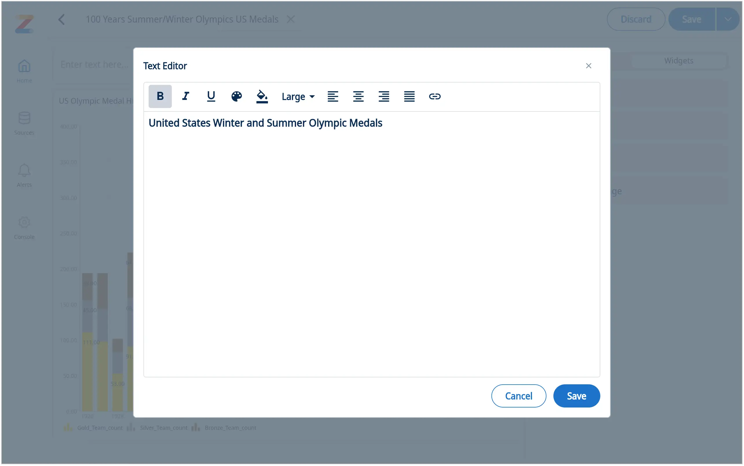
Add text: change font size, color, alignment and add links
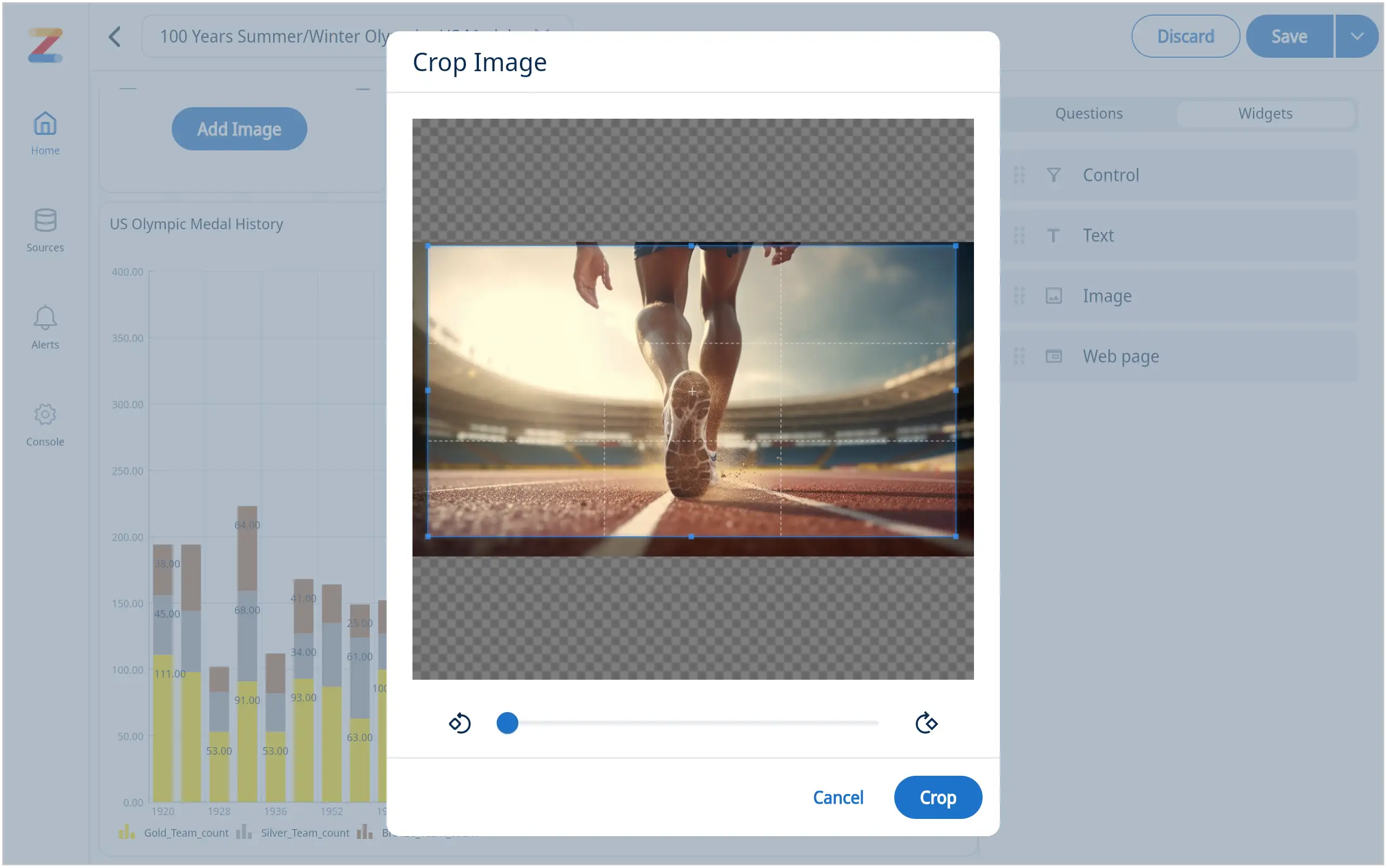
Add an image: resize and crop for the best fit
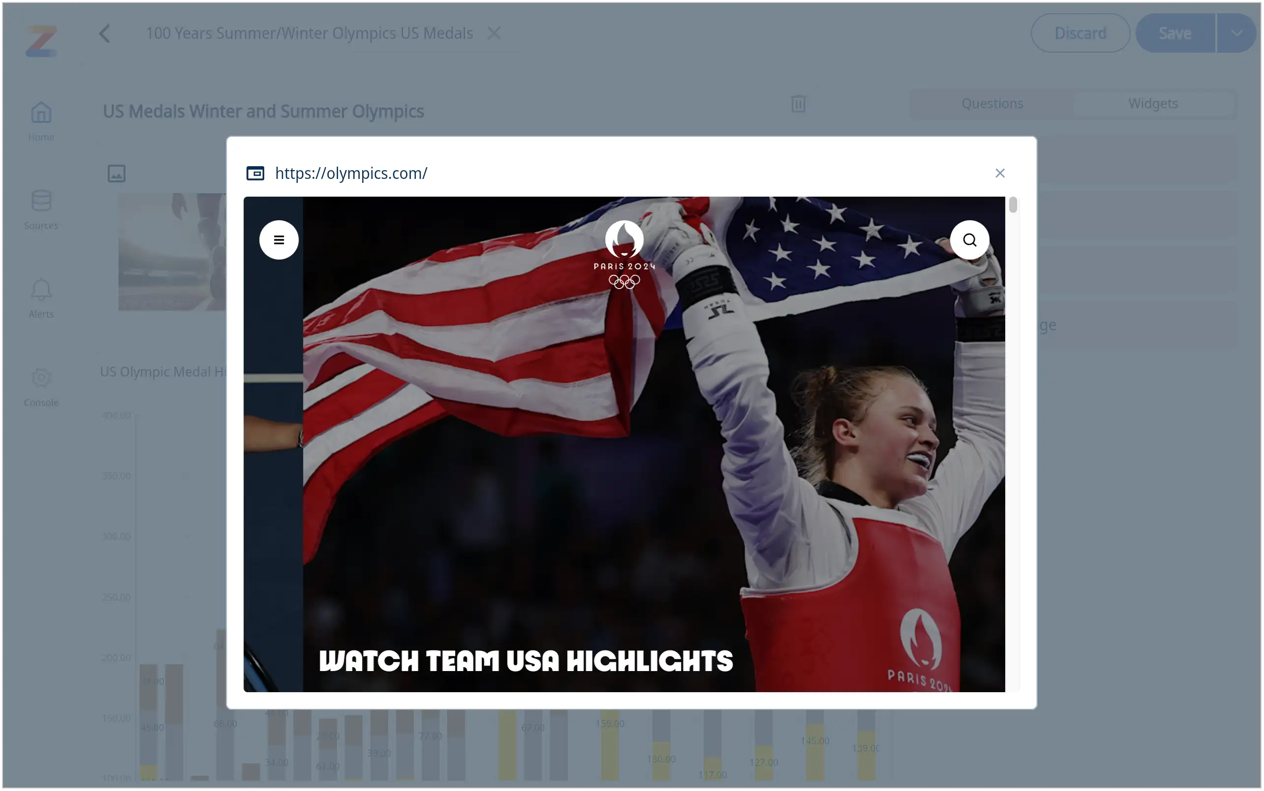
Add a web page
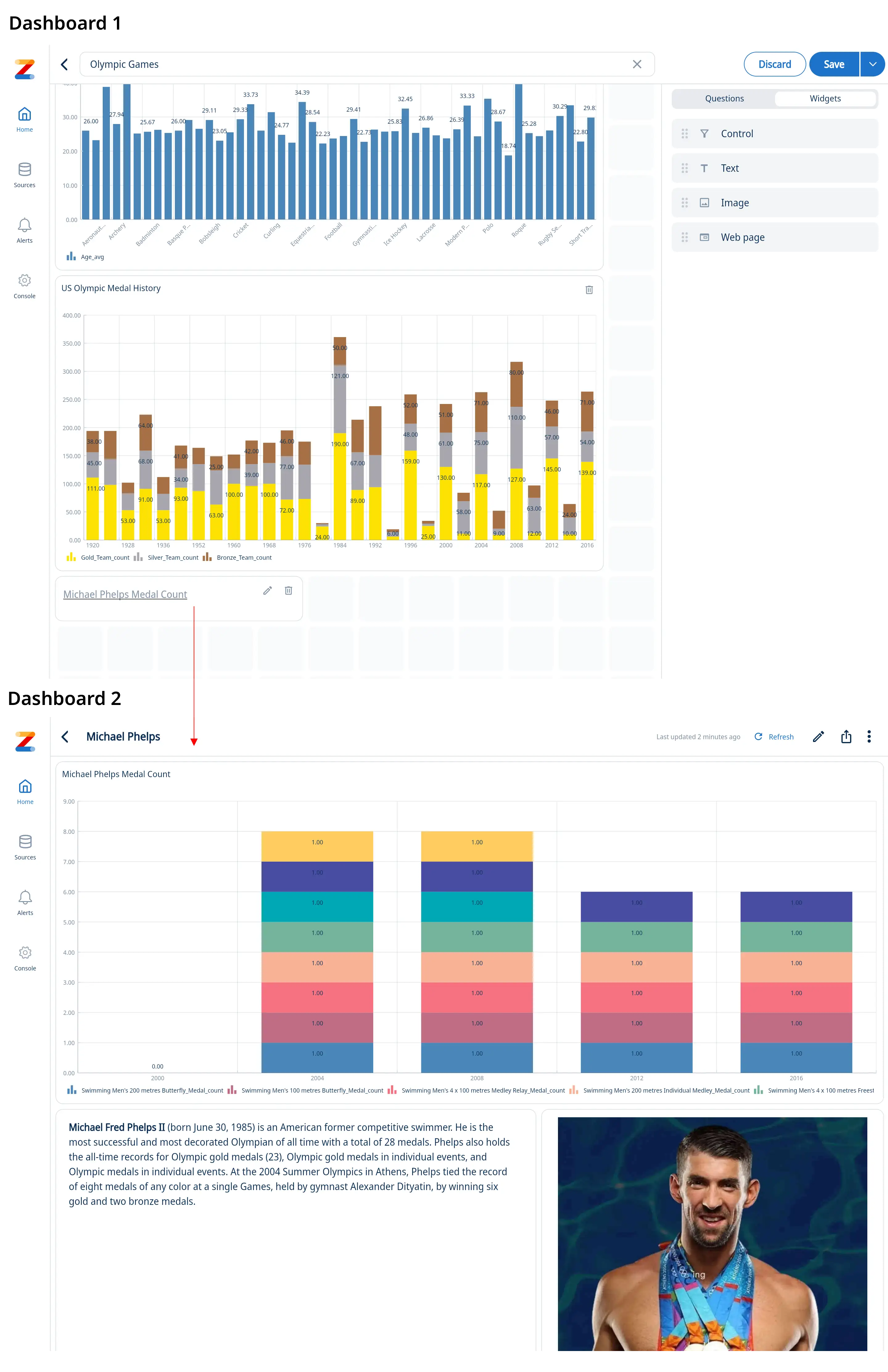
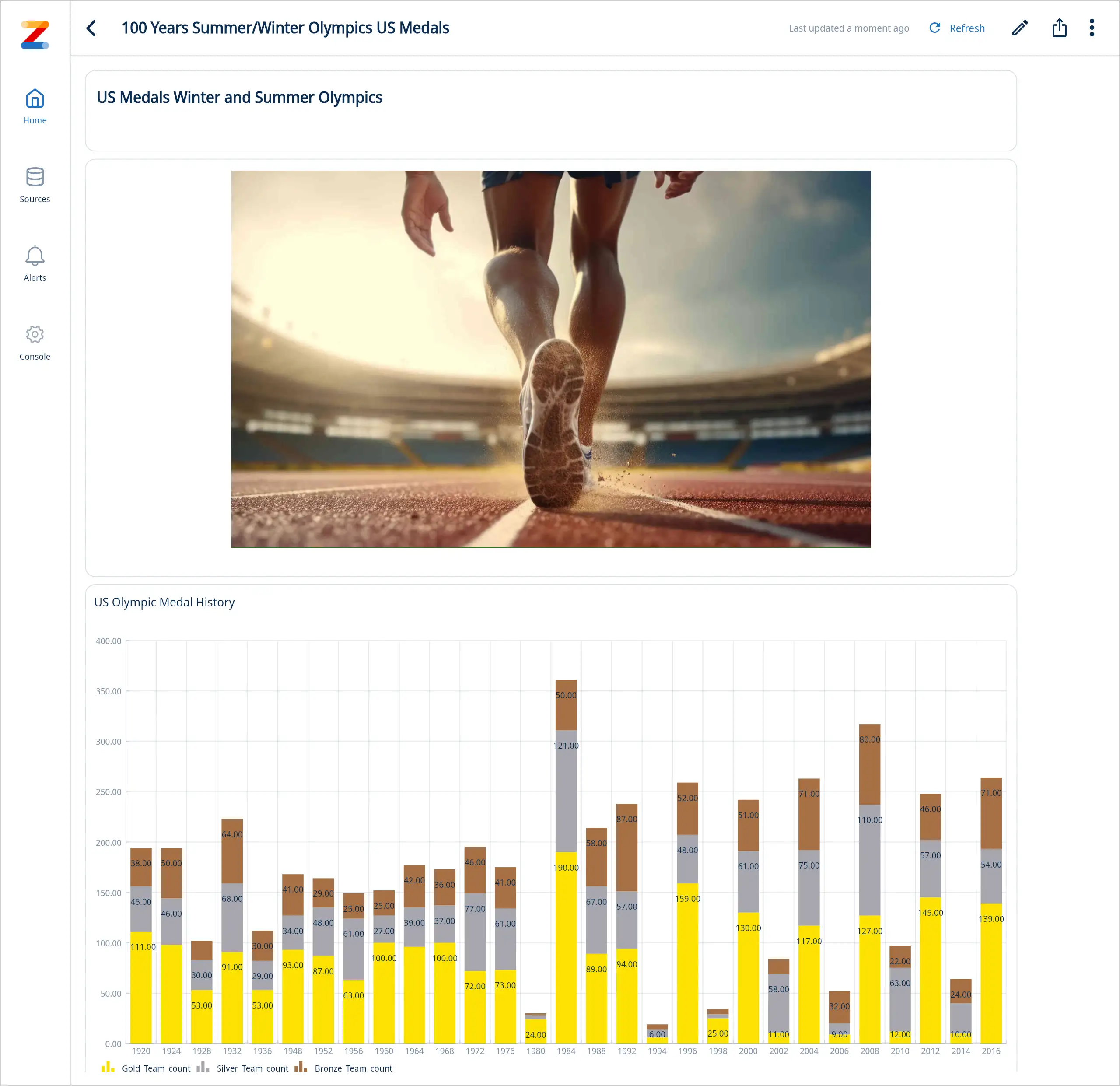
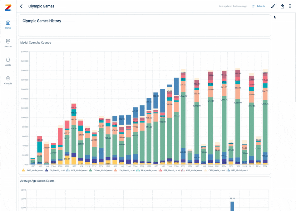
Here is a sports related dashboard example with custom text and images
How to link dashboards
- Add a text widget to your dashboard
- In the text widget click Edit
- Enter single link or multiple links (you can link to multiple dashboards in one text box)
- Select link text and click on the link icon
- Select “Dashboard” radio button Select the desired dashboard from drop down menu
- Click “Ok”
- Click “Save” in the text editor window
Linked dashboard example