Charting & Data Tables
Zing will automatically display the data in a way that makes sense for the data you selected. For instance, if you have time as field in your question, Zing will automatically plot time on the x-axis from low to high. You can easily change to an alternative visualization if you wish, and can re-order data points, as described below.
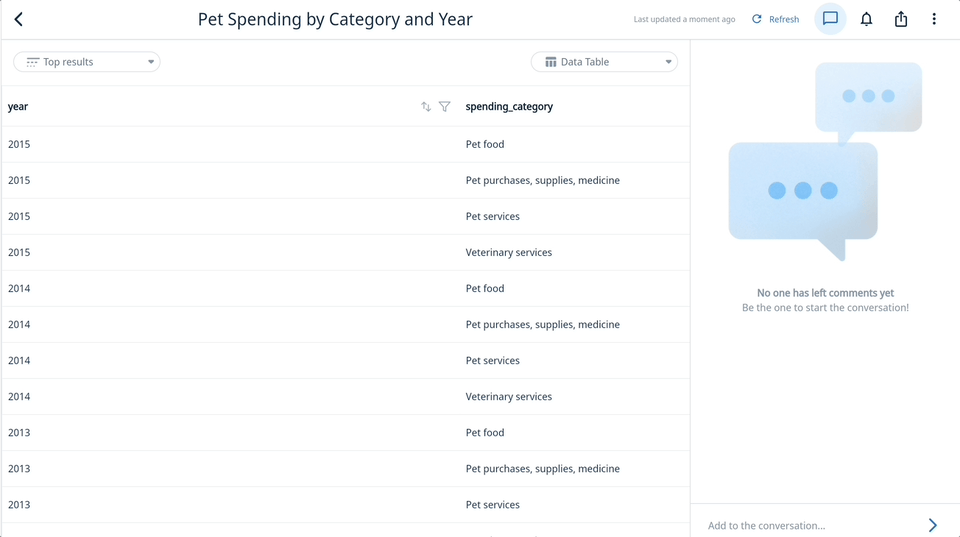
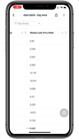
If a question does not have a visualization which can be displayed (e.g. a table of text fields), Zing will simply show a table of results. Custom queries (where you provide SQL instead of using Zing’s tap-to-query interface) will display results using a table.
Visualization Types
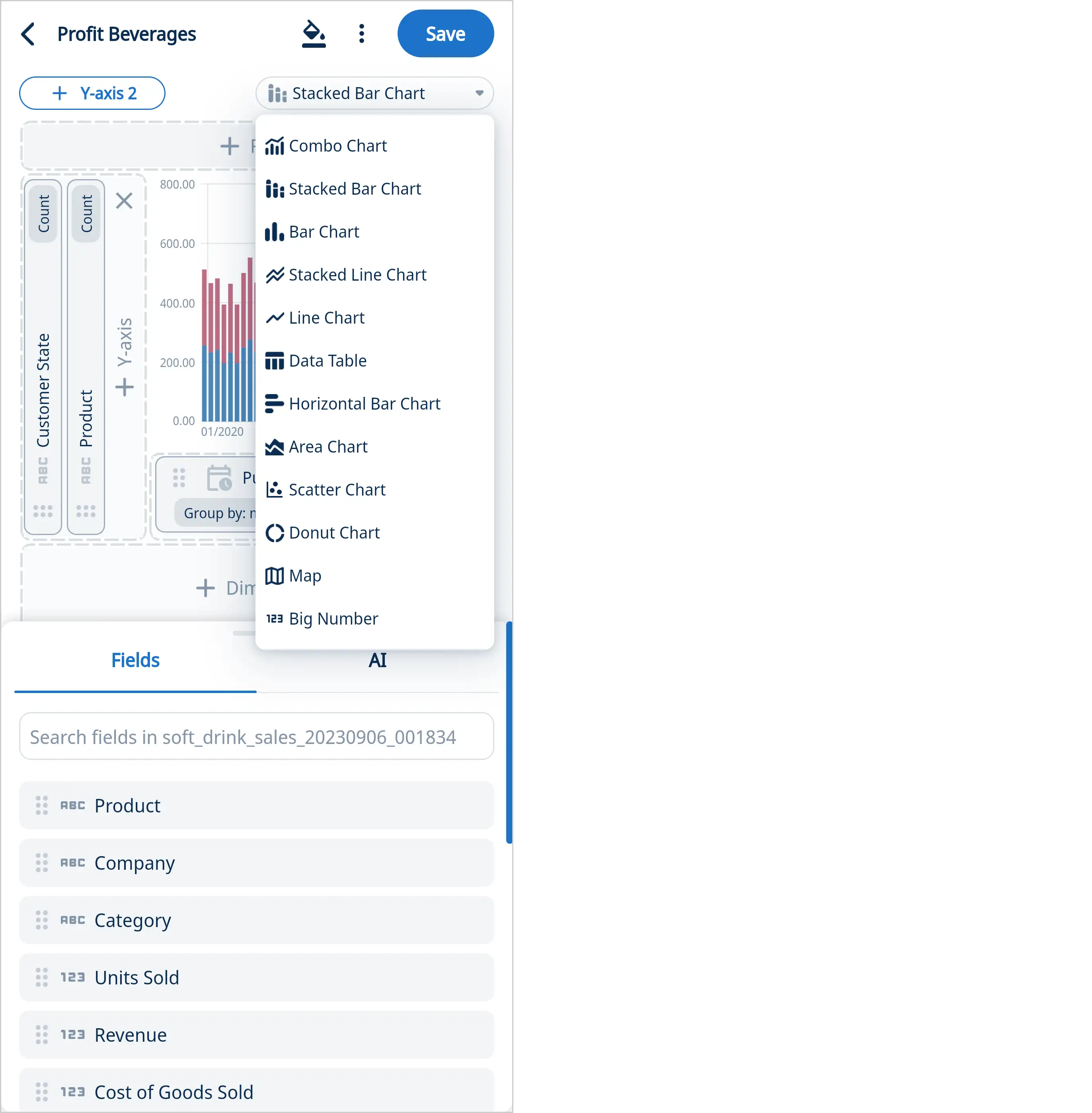
Zing offers a range of visualization types, which vary based on the number of fields (and field type) returned in your question’s answer:
- Bar
- Stacked Bar
- Stacked Bar 100%
- Stacked Line
- Line
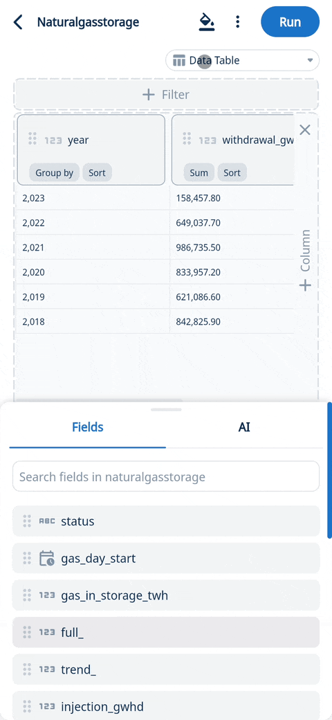
- Data Table
- Horizontal Bar
- Area
- Scatter Plot
- Donut
- Map
- Funnel
- Big Number
- Combo chart (Line + Bar)
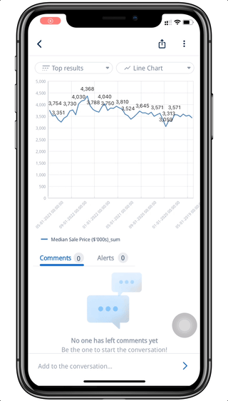
Toggle between chart types and data tables by tapping the upper right Chart Selection drop down
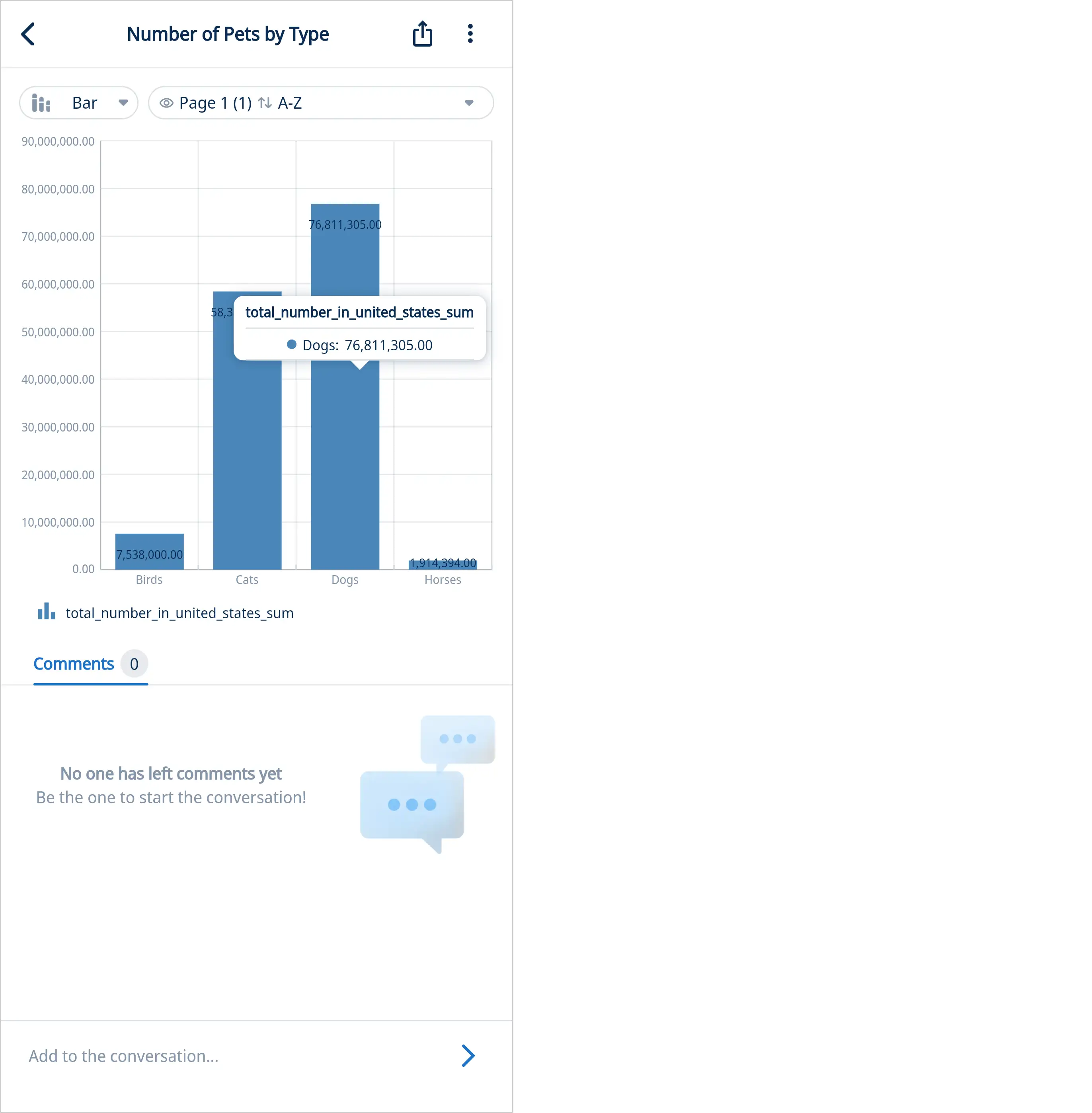
Tap on a data point in a chart to see a tooltip showing with the value of that data point and its category.
On iOS and Android, you can pinch-to-zoom into specific values or part of a graph.
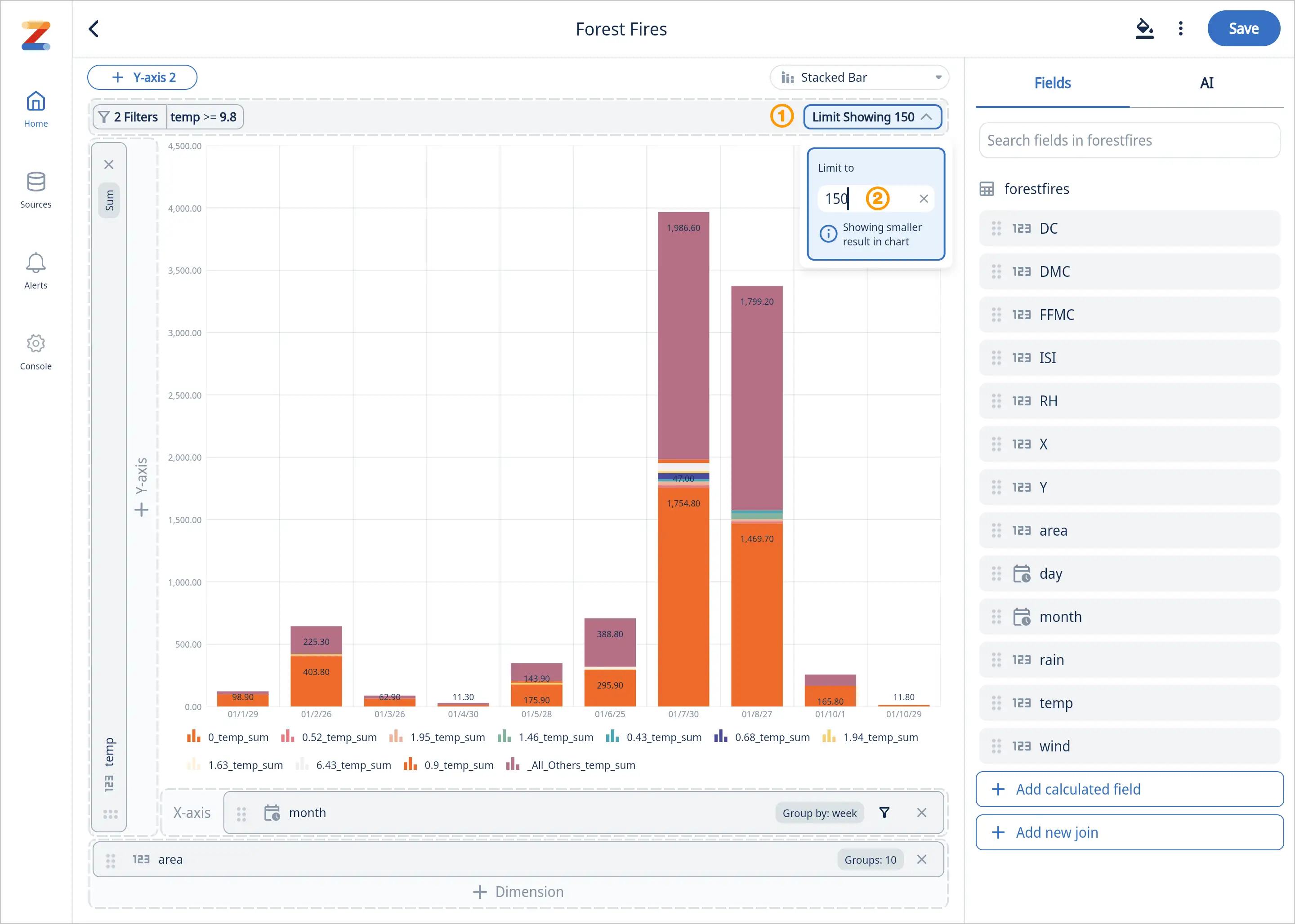
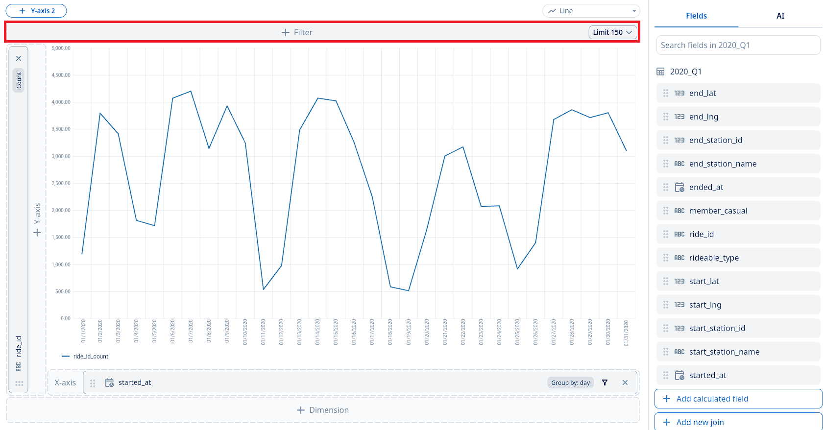
Limits
By default, a limit is applied when you run a query (50 by default) and that is shown in the filter section to speed up query runtimes, and reduce visual clutter.
To adjust the data shown, click on the ’limit’ section in the filter panel [1] and enter a custom value (up to 10,000) [2].
If you are using custom SQL, no limit will be applied unless you have specified a limit within your custom SQL code.
If you need to export the full dataset to CSV, please visit the Exporting Graphs and Data Tables section below where you can export the full results set with no limits.
Sorting
You can easily change the order values are displayed on the graph or data table.
To sort a graph, tap the x-axis and a ‘sort by’ controls will appear below your chart. You can sort by the x-axis, or y-axis from ascending or descending order.
To sort a data table, tap the field name and it toggle between unsorted, descending, and ascending.
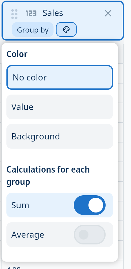
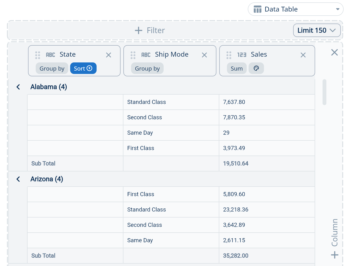
Grouping and Totals
In Data Table mode you can optionally show the first value of a category (akin to a pivot table in Excel) by clicking ‘Group By’ and then turning on ‘Show Distinct Values’, organizing the subcategories within.
- For Sum, Count, and Count Distinct, you can optionally show subtotals for ‘Group By’ fields using the ‘Show Totals’ feature.
New Features:
- Window Size: Specify the window size to control the data scope within your tables. This lets you manage how many groups are displayed and consolidate less common values into an “other” category for better clarity.
- Grouping: By default, you’ll see 10 groups with 9 main groups and the rest categorized as “other.” You can change the number of groups by updating the value.
- ‘Partition By’: Enhanced support for the ‘partition by’ clause enables more efficient data partitioning and the ability to handle more complex calculations in calculated fields on the Y-axis when displaying charts.
Note: Filters support up to 6 layers of nesting within filter groups. This feature is compatible with both natural language and visual query inputs.
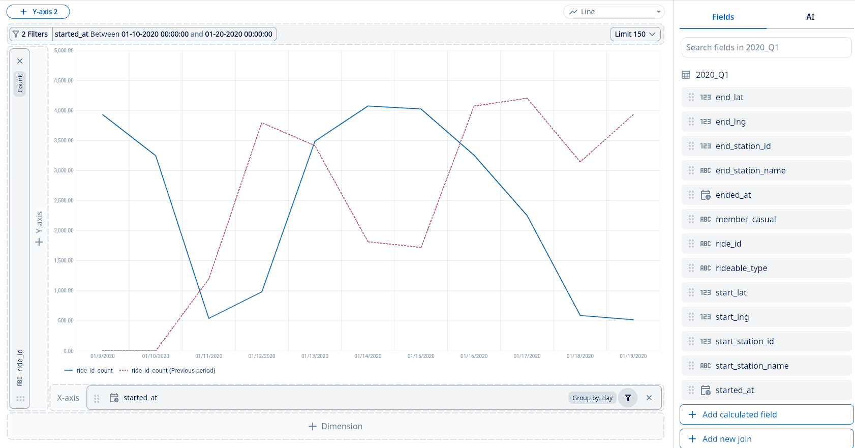
Time Comparisons
You can easily change the order values are displayed on the graph or data table.
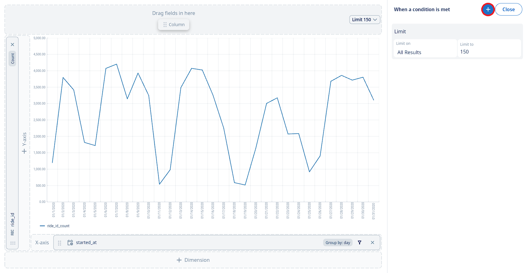
To add a time comparison to your chart or data table, simply:
-
-
Locate the filter or conditions area for your chart. Click the ’+’ icon to add a new condition.
-
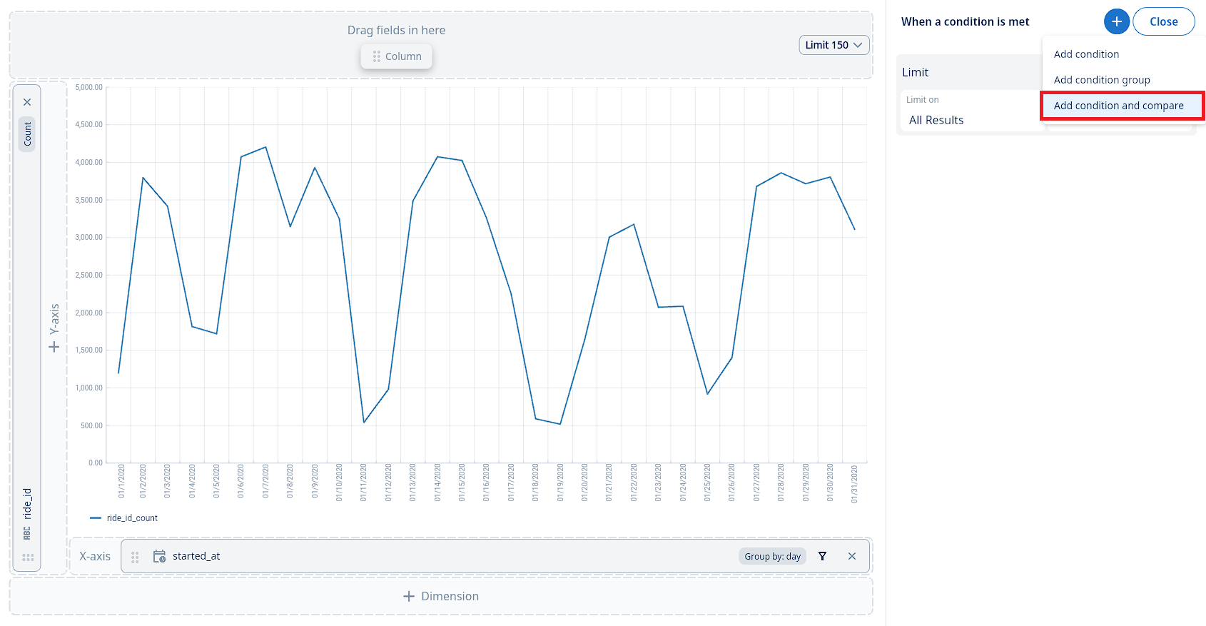
From the menu that appears, select “Add condition and compare”. This will open the interface for setting up your time-based comparison.
-
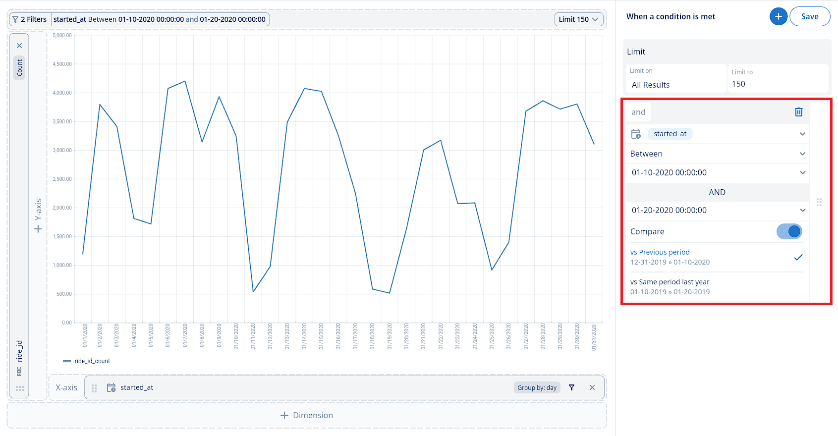
Configure your time comparison:
- First, select the date/time field you wish to analyze (e.g., event_time).
- Next, define the primary time range for your data. You can choose from options like:
- Relative past dates (e.g., “Past 60 days”, “Previous 12 months”)
- Specific date ranges (e.g., “After a date”, “Between two dates”)
- Relative future dates (e.g., “Next 24 hours”, “Next two quarters”)
- Relative past to future dates (e.g., “Past 7 days to next 7 days”)
- Ensure the Compare toggle is switched ON.
- Finally, select your desired comparison type:
- vs Previous period: This compares your selected time range with the immediately preceding period of the same duration. For example, if you selected “Past 60 days”, this would compare it to the 60 days prior to that period. If you chose March 15 - March 25 (10 days), the previous period comparison would be March 5 - March 15.
- vs Same period last year: This compares your selected time range with the exact same date range from the previous year. For example, if you selected March 15, 2023 - March 25, 2023, this option would compare it to March 15, 2022 - March 25, 2022.
Relative dates into the future dates can be useful for looking at forecasts and having a ‘rolling’ period which always shows data relative to the time the question is run.
-
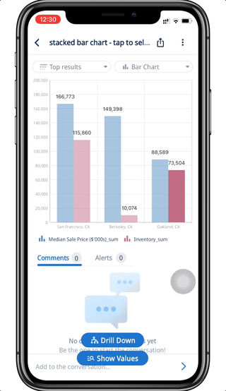
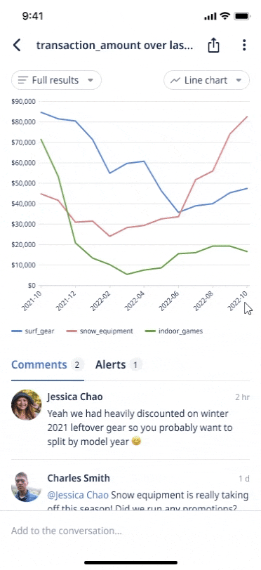
Exclude, Drill Down, or Show Values for Specific Data
Explore your data further with an easy-to-use contextual menu, take a quick tour:
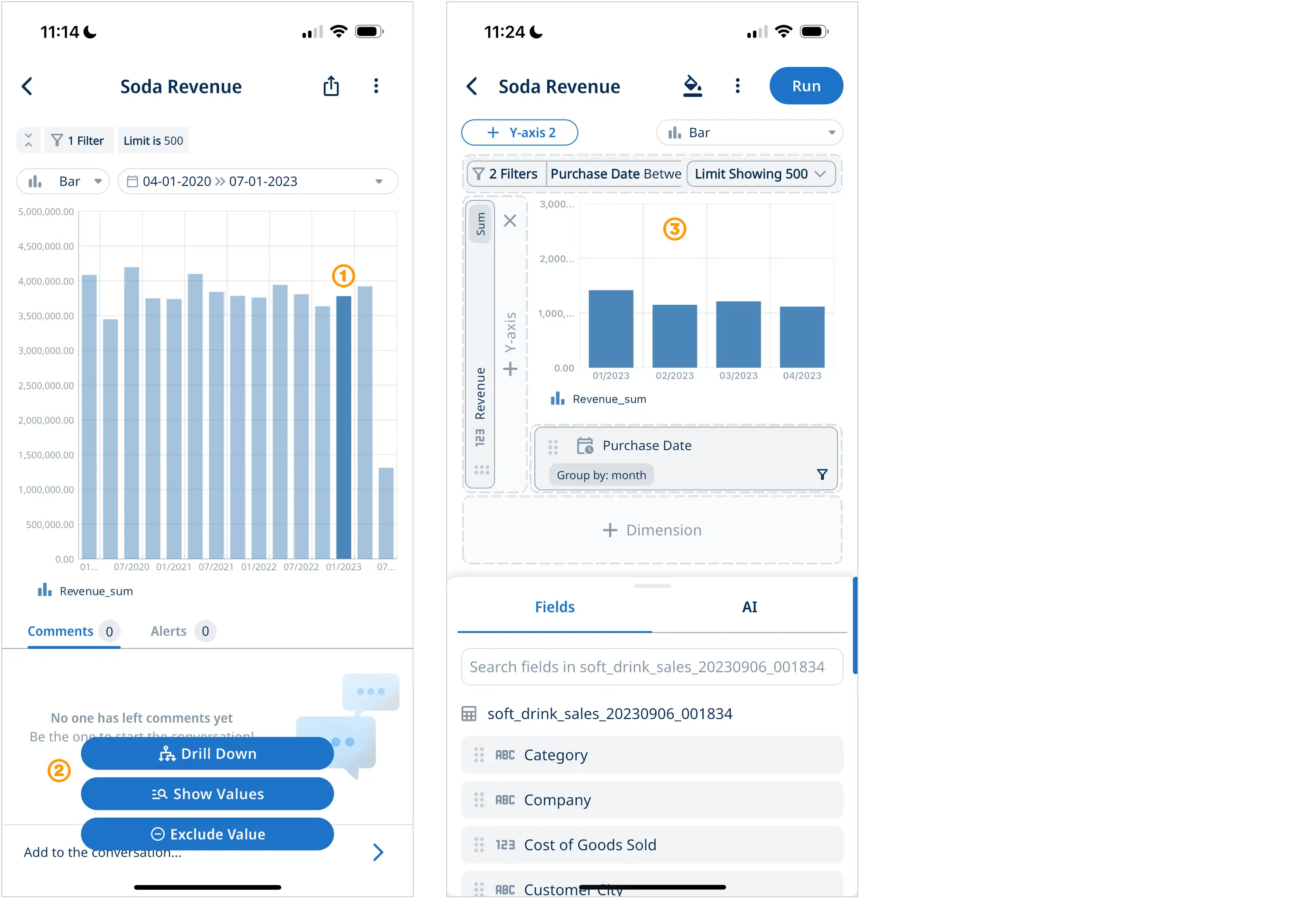
- On mobile tap and long press on a data point on a graph, or on desktop simply click on a data point
- A contextual menu will appear with three options to explore your data furter
- Drill Down to focus on the selected data on the next screen
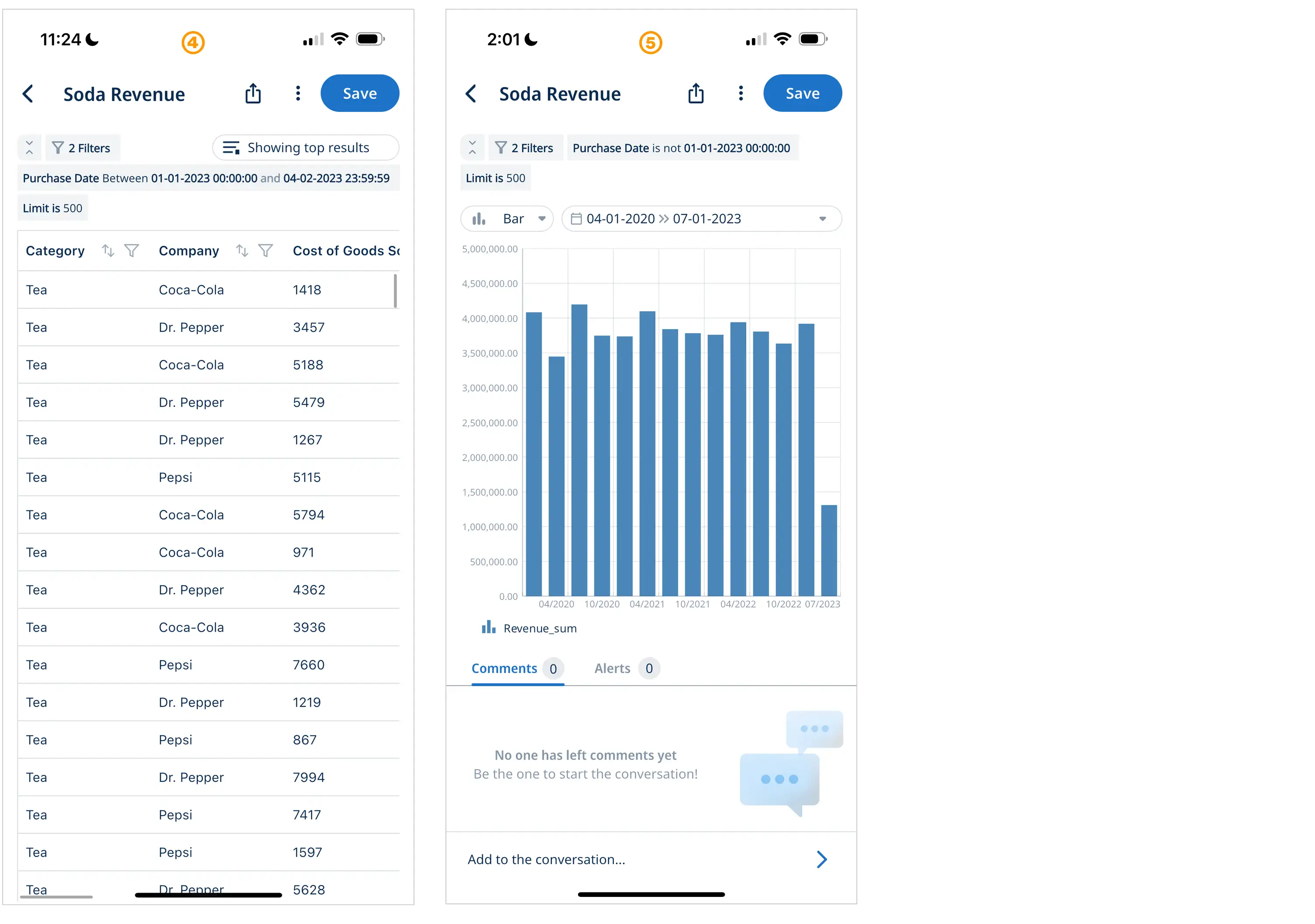
- Show Values will show you table with the selected data
- Exclude Value shows you an updated chart without the selected data point
Mobile: Drill Down Demo Video
Desktop: Drill Down Demo Video
After clicking on the tooltip, you will be brought to the SwiftQuery editor, with axes or columns pre-populated to match those of the original graph or table, along with a filter applied based on the data selected.
For example, if I select a line in a Line Graph that represents the Region of San Francisco, CA, the SwiftQuery editor applies a filter with the condition of Region = San Francisco, CA along with the graph’s original axes.
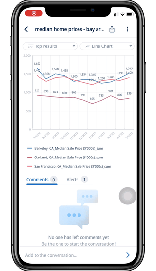
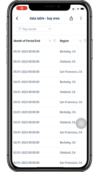
If I select a cell in a Data Table which has the value of Berkeley, CA for Region, the SwiftQuery editor applies a filter with the condition of Region = Berkeley, CA along with all the columns in the original table.
From here, you can modify your query in the editor before running to dive deep into specific data!
Exclude with a Dimension
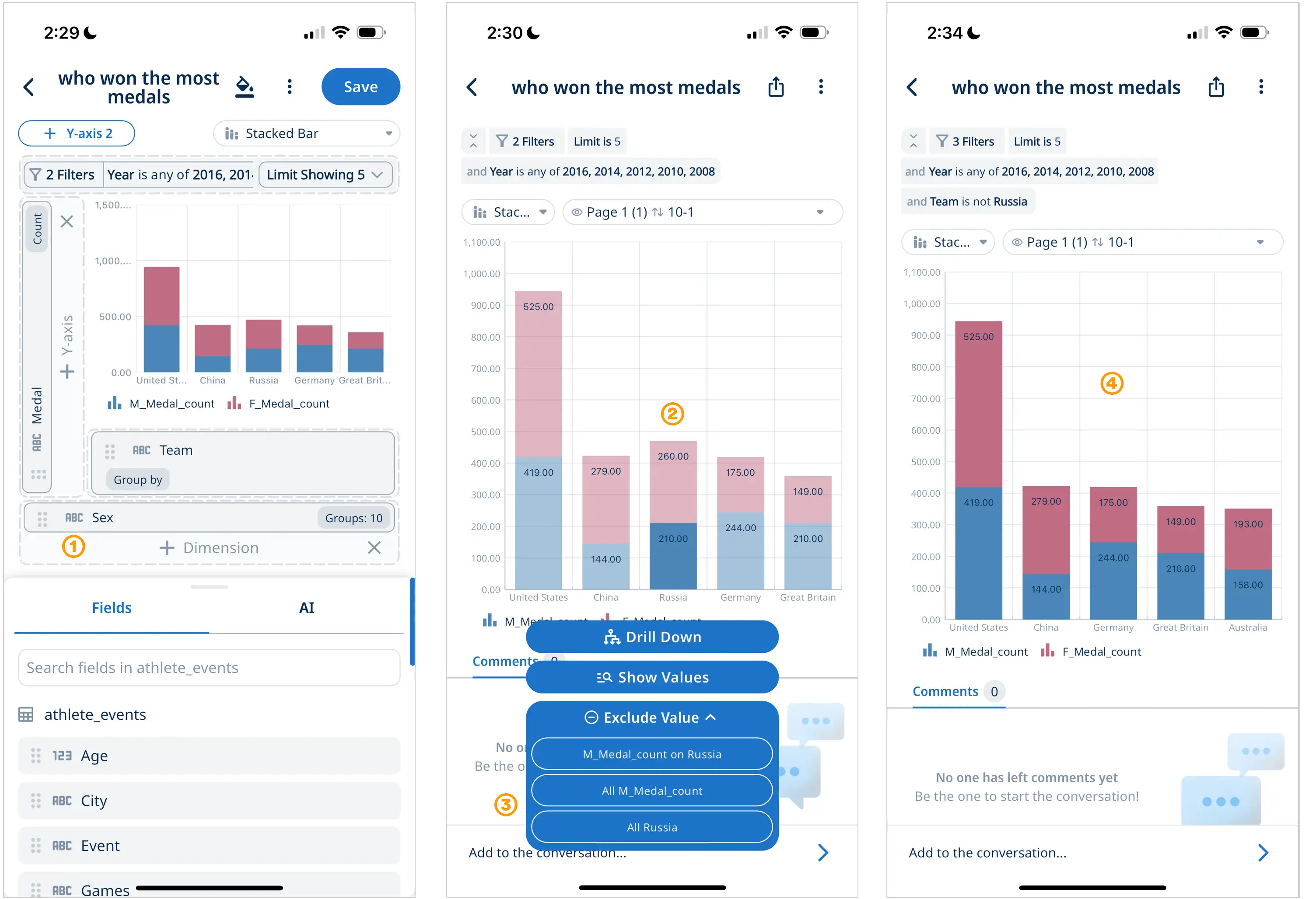
- Add a dimension to a data visualization for additional Exclude capabilities
- Select the data point you want to explore
- Exclude Value in the contextual menu now allows you to exclude data by axis or dimension
- See your updated data visualization with excluded data
Identify Other Data with the Same Values
You can also “zoom out” and identify other data that share the same value for a particular field or column.
To see the “Show Values” tooltip, it is the same mechanism as to see the “Drill Down” tooltip.
After clicking on the tooltip, a Data Table with all columns will be presented, along with rows of data with values matching the data point or cell that was selected.
For example, if I select a point in a time-series graph and run “Show Values”, I will be able to see a Data Table with all values at the specific time of the data point selected.
If I select a cell in a Data Table with the value of 70 for Homes Sold, a Data Table will be returned where I can all data for months where homes sold in a region equals to 70.
Time and Date Formatting
To change the time and date formatting, tap the x-axis or a table cell, and formatting options will appear in the bottom sheet. Tap on the “Date format” dropdown to choose your preferred formatting options. The options you see will match the time granularity of your question.
If you choose the “custom” option, you can construct a custom format with the following symbols:
| Symbol | Meaning | Presentation | Example |
|---|---|---|---|
| y | year | number without truncation or leading zeros | 2012 |
| yy | year | number truncated to the last two digits | 12 |
| yyyy | year | four-digit number, with leading zeros if necessary | 2012 |
| M | month in year | number without a leading zero | 3 |
| MM | month in year | two-digit number, with a leading zero if necessary | 03 |
| MMM | month in year | abbreviated name | Mar |
| MMMM | month in year | full name | March |
| d | day in month | number without a leading zero | 6 |
| dd | day in month | two-digit number, with a leading zero if necessary | 06 |
| EEE | day of week | abbreviated name | Tue |
| EEEE | day of week | full name | Tuesday |
| h | hour in am/pm (1~12) | number without a leading zero | 1 |
| hh | hour in am/pm (1~12) | two-digit number, with a leading zero if necessary | 01 |
| H | hour in day (0~23) | number without a leading zero | 13 |
| HH | hour in day (0~23) | two-digit number, with a leading zero if necessary | 13 |
| m | minute in hour | number without a leading zero | 7 |
| mm | minute in hour | two-digit number, with a leading zero if necessary | 07 |
| ss | second in minute | number without a leading zero | 55 |
| ss | second in minute | two-digit number, with a leading zero if necessary | 55 |
| a | am/pm marker | PM | |
| ' | escape for text | ‘Date=’ | |
| '’ | single quote | ‘o’‘clock’ |
You can use characters like ‘/’, ‘:’, ‘-’, ‘.’ directly, without enclosing them in single quotes.
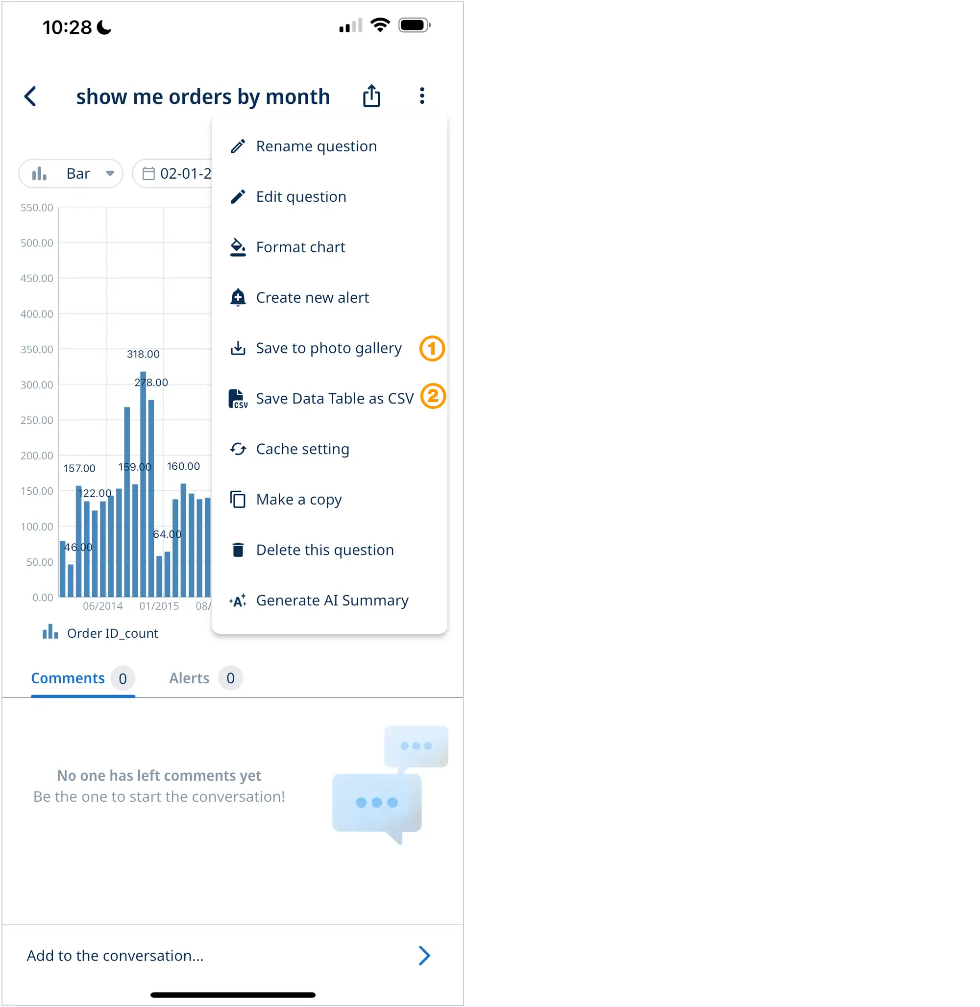
Exporting Graphs and Data Tables
Save graphs [1] to your phone’s photo gallery by tapping the three dots in the top right of the app and click ‘save to photo gallery’. You may need to grant Zing permissions to save files to your phone. These images will be saved as PNGs and can be accessed by other apps on your phone to make it easy to send charts and analysis in email, Slack, and to embed in documents from your mobile device. Easily drop these graphs into Slack, Microsoft Teams, Google Slides, Microsoft Powerpoint, Microsoft Word, or Google Docs.
Save tables [2] to your phone by tapping the three dots in the top right of the app and click ‘save table as CSV’. You may need to grant Zing permissions to save files to your phone. This will provide a comma seperated values file which can be used in other apps on your phone such as email, Google Sheets, Microsoft Excel, and more.
Large Exports
By default, Zing shows you top results by limiting how many data points are shown in a graph or table preview – but gives you the full control to get all data as a CSV (even up to multiple gigabytes). We’ve tested it up to tens of millions of rows and 3 GB + files.
Get started with large exports:
- Create a question
- Save the question (large exports require the question to be saved first)
- Tap the three dots in the upper right, the ‘Export to CSV’
- The file will automatically download once the full query runs and the result is complete
Zing’s large export capability (more detail here) works with Clickhouse, Postgres, BigQuery, and other data sources. If you’d like it for other data sources, let us know.
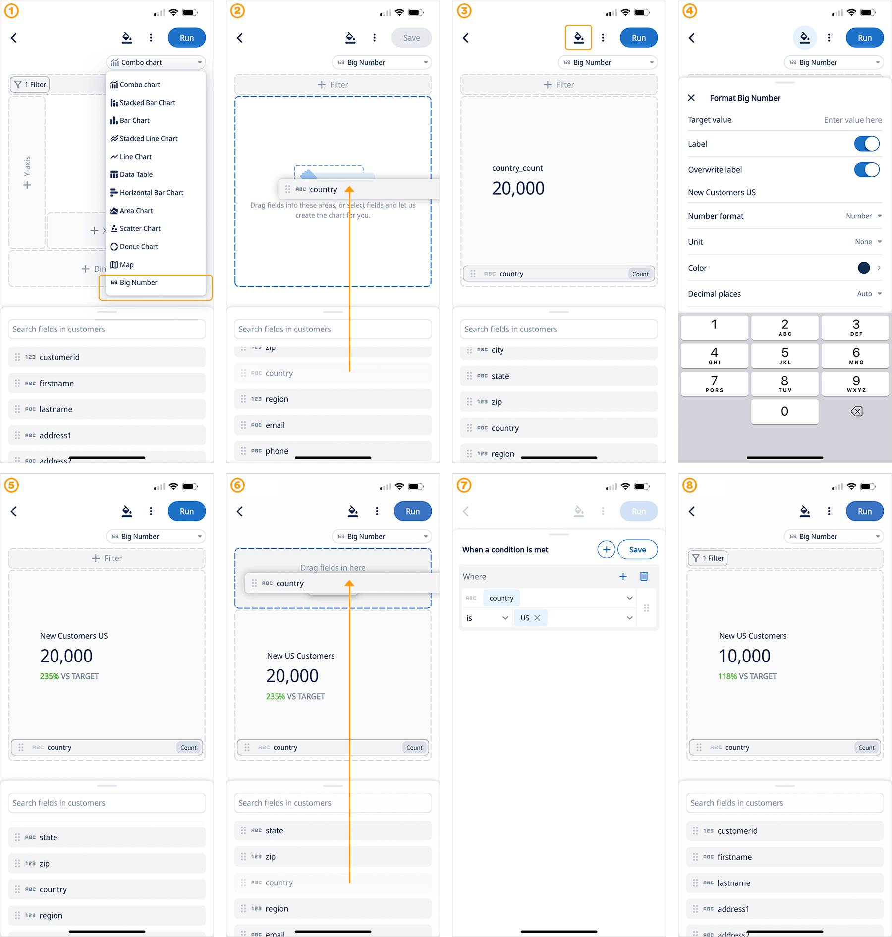
Big Number Chart
Select the data you want to work with from ‘Data Source’ and start building:
-
Once you are in the chart builder select “Big Number” from the chart menu
-
Drag a field into the chart builder
-
Now you can see a big number, click formatting to fine tune the presentation
-
In the format sheet you can quickly add a your own custom target value, overwrite the field name, change font color and more!
-
Technically you are done, you have created a big number data viz!
But there is more: -
Add a filter to segment your data
-
Configure the filter with easy to use conditions
-
Run and save your visualization!
Calculate multiple percentiles on the Y-Axis
This feature allows users to gain deeper insights into their data distribution by displaying various percentile values along the vertical axis of a chart. This functionality is particularly useful in statistical analysis, where understanding the spread and distribution of data points is crucial. By plotting multiple percentiles, such as the 25th, 50th, and 75th, users can quickly identify trends, outliers, and the central tendency within their datasets. This feature enhances the ability to conduct comprehensive data analysis, providing a clearer picture of the data’s behavior and characteristics, and enabling more informed decision-making based on a detailed percentile analysis.
Define sort order for data series
To enhance the user experience and ensure viewers can quickly understand the visualization, our platform now lets you define the order series are displaed on a chart. Easily rearrange the segments within a bar charts using drag and drop functionality in the format panel. This added control allows for customized presentation of data, ensuring that the most relevant information is highlighted according to your preference.For instance, if you had data split by city, and always wanted to ensure that New York is shown at the bottom of a stacked bar chart, you could simply drag New York to reorder the series order and get the visualization perfect.
Intuitively sort table columns the fast way
Sorting columns server side significantly improves performance and speed, when dealing with large datasets. Instead of downloading and sorting the entire dataset on the user’s device, which can be resource-intensive and slow, or only locally sorting the partial data on the client, the server now handles the sorting logic and sends only the correctly sorted data to the client. This method ensures faster response times and a smoother user experience, as it minimizes the amount of data transmitted and reduces the processing load on the user’s device.
Pivot table grouped aggregations
Group Aggregations brings pivot table capabilities so you get subtotals, grand totals, and group averages within data tables.
- Create a ‘data table’ question
- Select group bys for the groups you want, and calculations (sum, count, etc.) for the fields you want numerical calculations on
- Click the paint bucket icon on the field header for fields you’d like group aggregations to be shown on. Select SUM or AVERAGE to show subtotals or averages for each group
- Grand totals will also be shown at the bottom of all groups
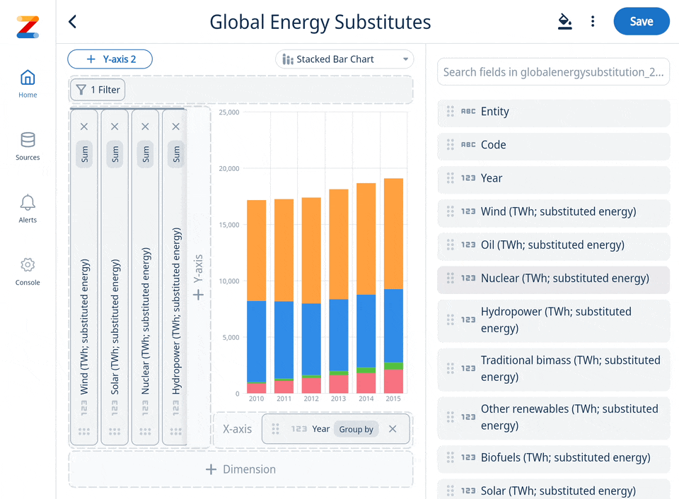
Stacked Bar 100%
A 100% stacked bar chart is a type of bar chart that shows the proportion of different categories within each bar, with each bar representing 100% of the total. This chart is useful for comparing the relative contributions of categories across different groups. To get started select “Stacked Bar 100%” from the data visualization menu, then drag fields to the X and Y axis and one more field to dimension.
Map: Control data clusters and zoom level
To effectively manage data clusters on a map, users can adjust zoom levels to control the display of data points. At the lowest zoom level ‘1’, all data points are visible, ensuring that no information is missed. As users increase the zoom to higher levels, up to ‘9’, data points begin to cluster, allowing for a more focused view of the map. This flexibility enables users to visualize broad trends at lower zoom levels or dive into specific areas of interest by clustering data at higher settings. To access this feature, click on the “Format” button while your visualization is in edit mode (see video).
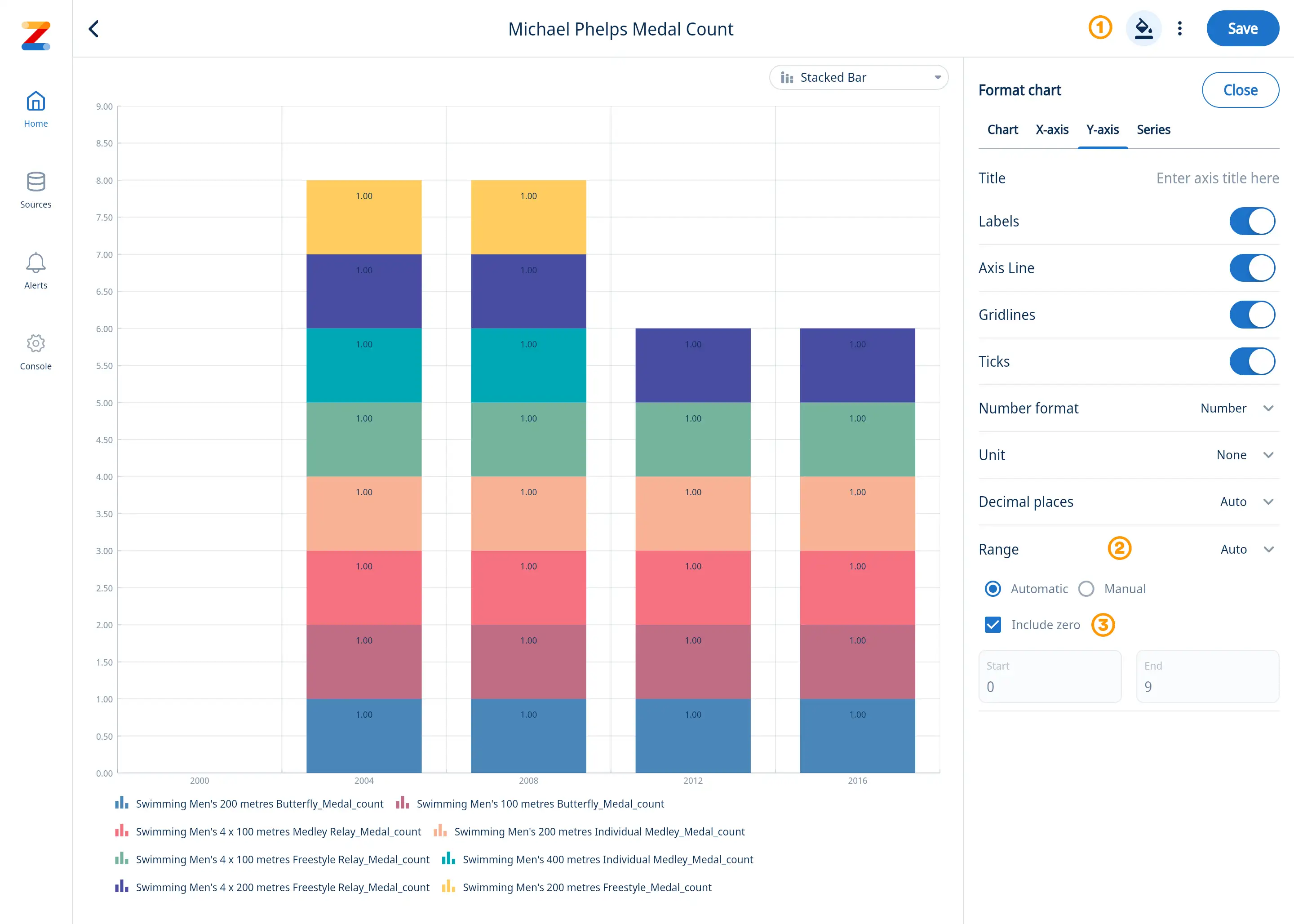
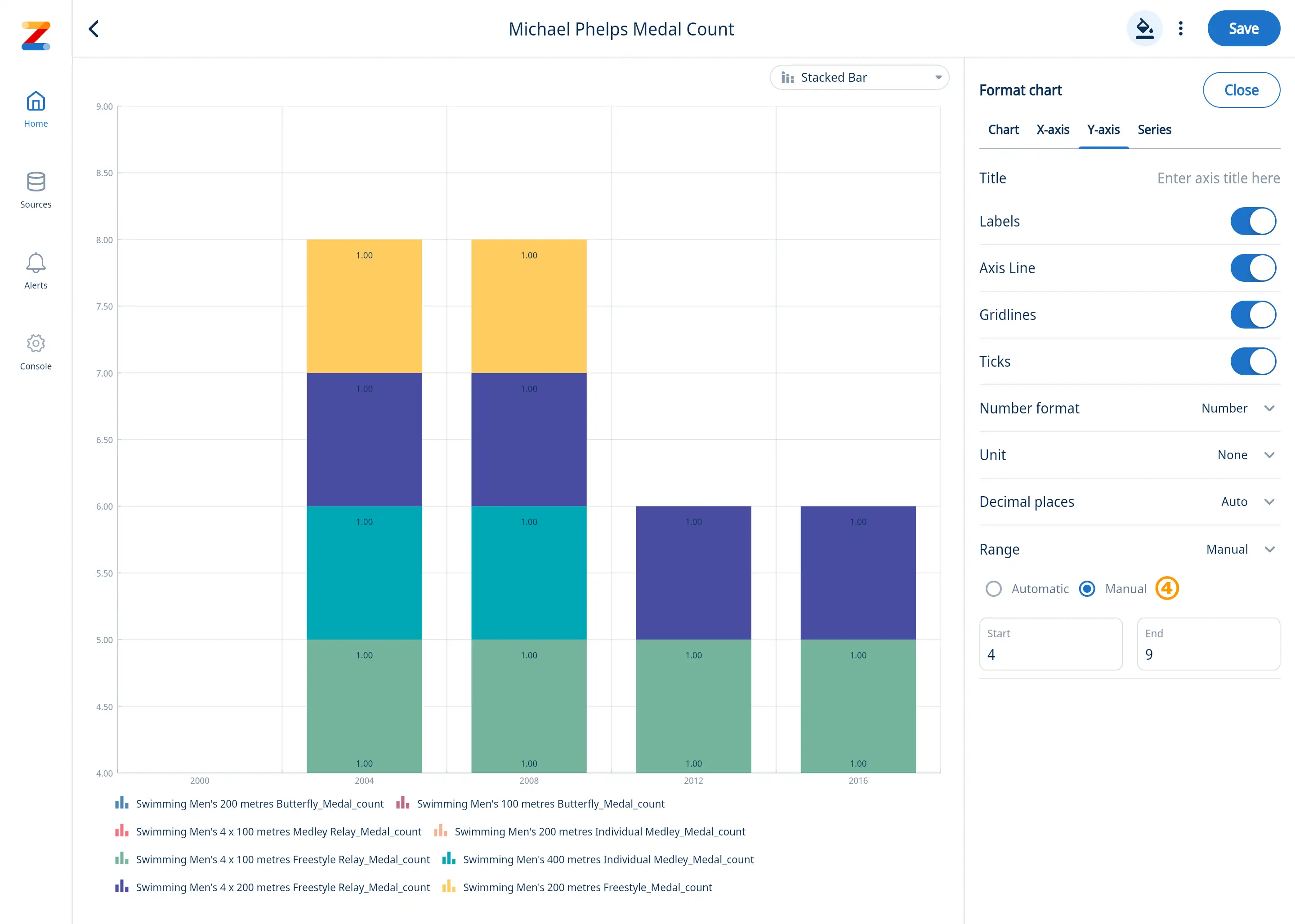
Format: Y-Axis Range
Setting a range on a chart allows users to define the minimum and maximum values displayed on the y-axis, providing better control over the data’s visualization. You can define y-axis minimum and maximum values displayed on the a chart, or opt for Zing to automatically determine them based on the values in your data. By default Zing will automatically calculate them, and will start the y-axis at zero (unless there are negative values in the data, in which case it will include the minimum value present in the graph results).
- Select ‘Format’ tab [1]
- Go to ‘Range’ [2]
- Switch between ‘Automatic’ (default) and ‘Manual’ as needed
- If ‘Automatic’ is selected, you can choose to deselect ‘Include zero’ on your chart [3]. If zero is excluded, the chart will display values based solely on the available data from your data source.
- If ‘Manual’ is selected, enter the desired start and end value [4] for your chart
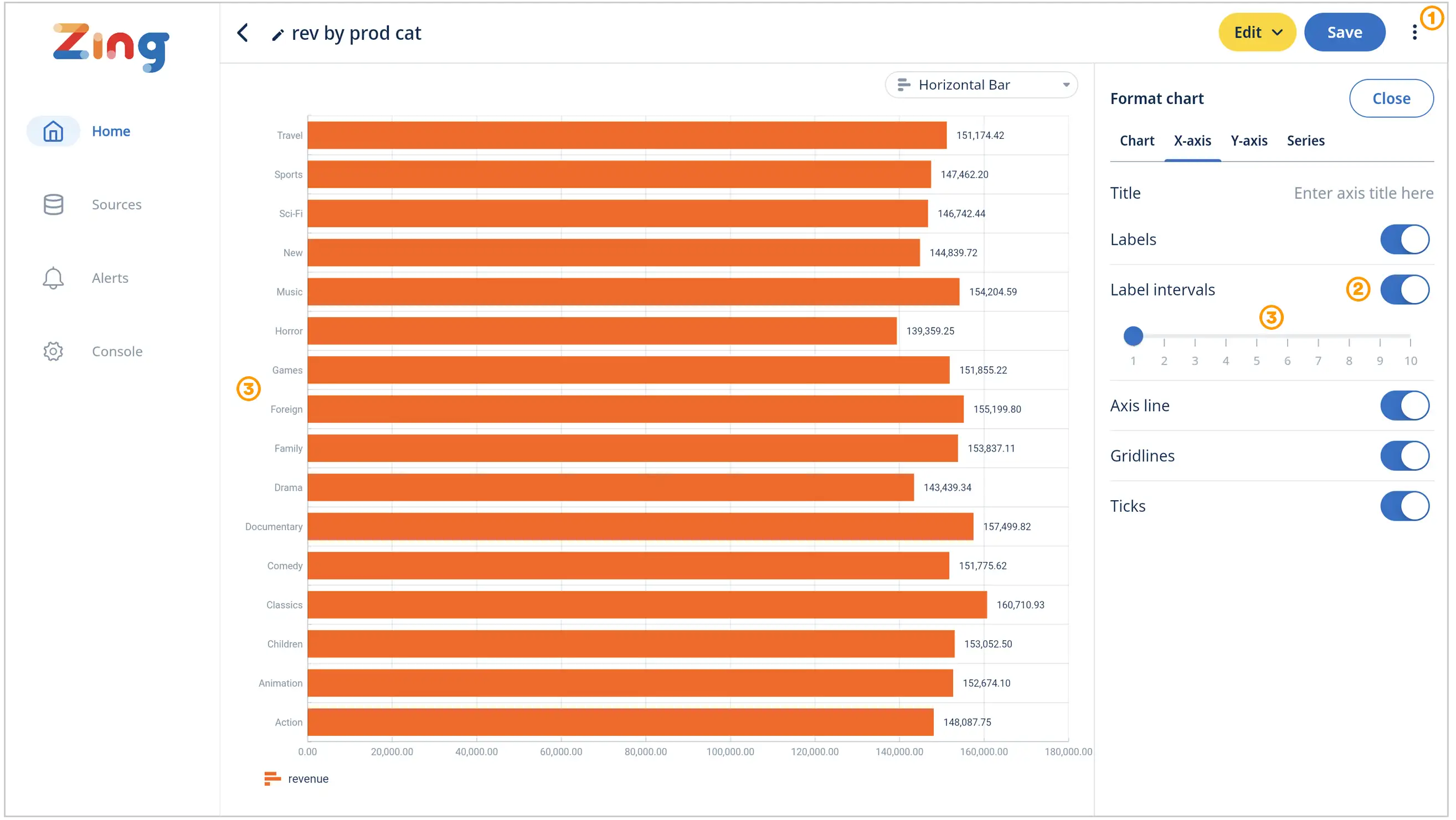
Format: X-Axis Label Intervals
Adjusting label intervals improves readability by preventing clutter and ensuring axis labels are legible. By increasing the interval, you reduce label overlap, making the chart easier to interpret. Conversely, decreasing the interval provides more detail but can make labels harder to read.
- When in edit mode, click the three dots then the ‘Format Chart’ option [1], then ‘X-Axis’
- Go to ‘Label Intervals’ and activate toggle [2]
- Adjust slider (1 = Show all labels, 10 = Show every 10th label)
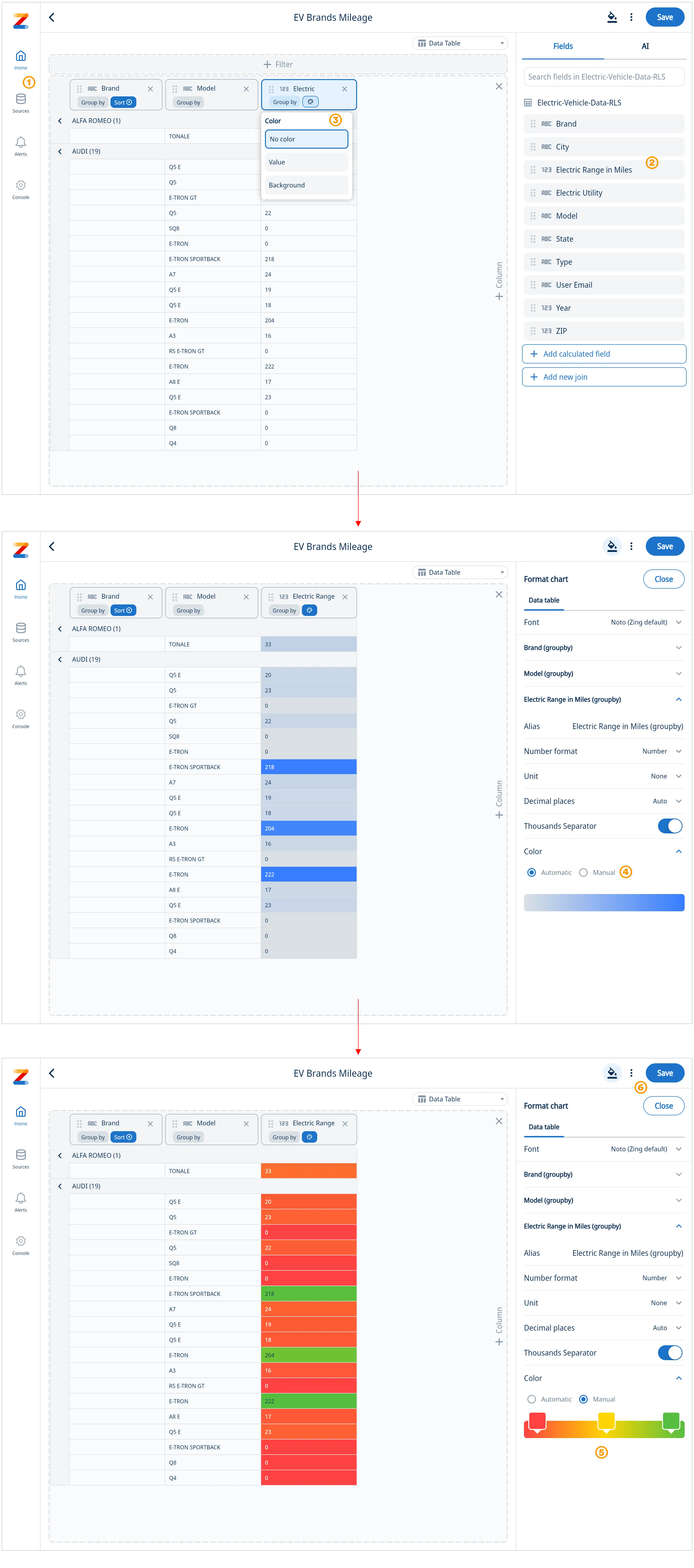
Heatmaps & Conditional Formatting
Zing supports heatmap formatting on data tables – letting you see at a glance outlier values, and the the distribution of values. A heatmap represents data values in a table format, using varying colors to signify differences in intensity, frequency, or magnitude.
Get started
- Select a data source
- Select and drag data fields into a data table
- Click on the paint icon on a numeric column and select to highlight background cells or values
- To customize the colors of your heatmap go to format and switch to manual
- Select your custom colors to build your heatmap. You can have coloring applied to the values or to the background, and Zing will automatically ensure that the text color is legible against light or dark dark background colors
- Save your heatmap
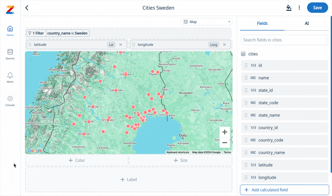
Geo Heatmaps
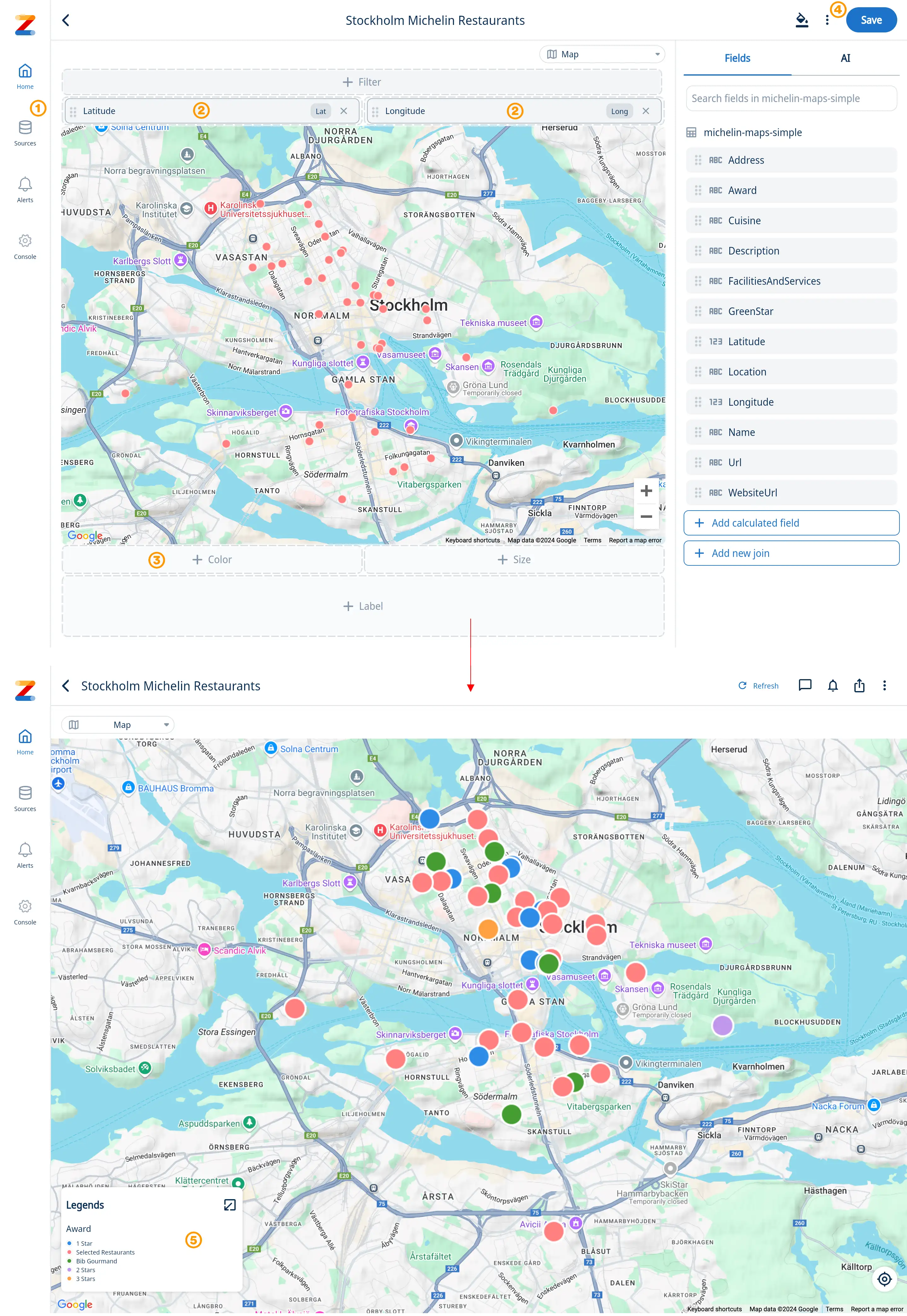
A geo heatmap overlays data intensity onto a geographic map, using color to represent variations across locations. From hotspots of customer activity to cold zones of underperformance, geo heat maps make data trends instantly recognizable.
Get started
- Select a data source that contains Latitude and Longitude for every location
- Select and drag the Latitude and Longitude fields into the chart builder
- Select and drag a field to separate the data by color (and size if your data supports it)
- Save your chart
- See your map with color coded data points and use the legend to quickly identify location based patterns
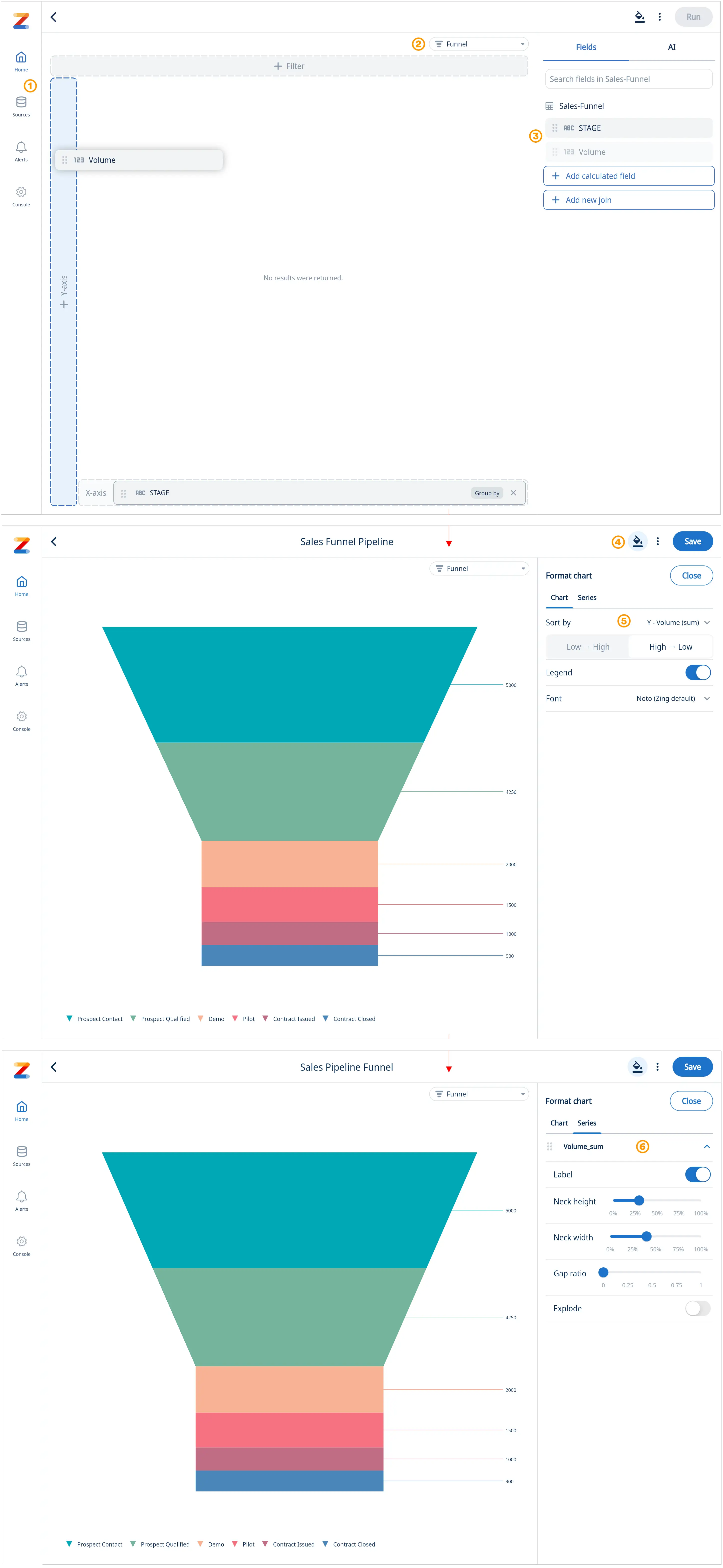
Funnel Charts
Funnel visualizations are a specialized chart type that visually represents a series of stages in a process. .
Get started
- Ask a question with natural language, or select a table/view from data sources
- Select “Funnel” from the chart menu
- Select and drag a field to the Y-axis and X-axis to build your funnel
- Select the format tab to fine tune your chart
- On the “Chart” adjust sorting (sorted High » Low by default), turn the legend on/off or switch to a different if desired
- Select the “Series” tab to further fine tune the appearance of your funnel such as neck height, neck width, and gap ratio. “Explode” adds a gap between the funnel steps.
Hyperlink Formatting in Table Visualizations
Zing Data supports clickable hyperlinks directly within table cells. This allows users to add links to tables making it easier to connect your data with actionable context.
Get Started
-
Plain URLs
If a cell contains a text string that begins with
http://orhttps://, it will be rendered as a clickable link. -
HTML
<a href>Tags<a href="https://example.com">Text to Display</a><a href="https://example.com" target="_blank">Open in New Tab</a>* The optional
targetattribute is supported (_blank,_self, etc.).
Example
| Displayed Text | Field Text |
|---|---|
https://api.example.com/docs | https://api.example.com/docs |
| Internal Report | <a href="https://reports.example.com/q1" target="_blank">Q1 Report</a> |
Support Ticket | <a href="https://support.example.com/ticket/123">Ticket #123</a> |

